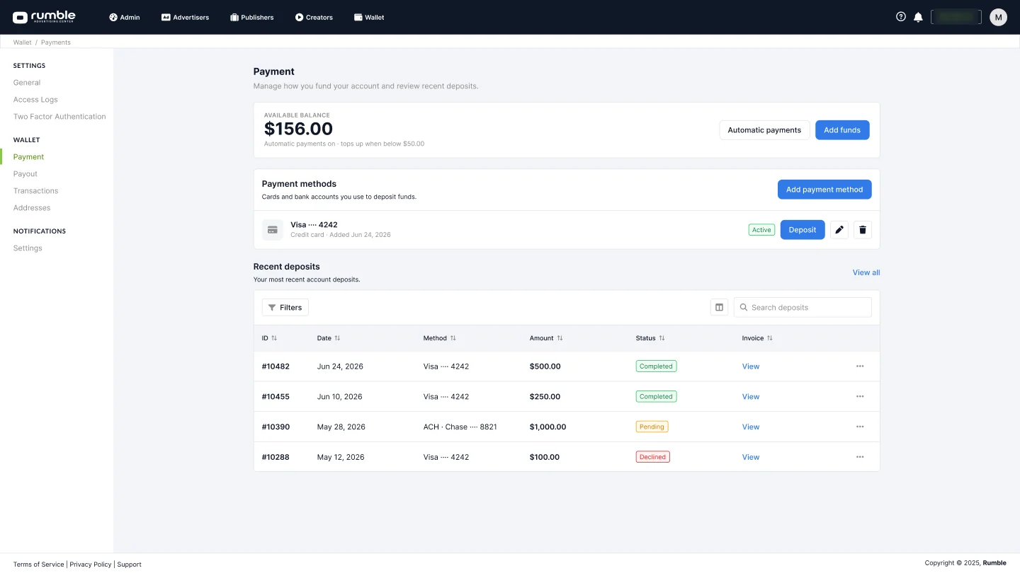
I lead design for RAC, Rumble’s advertising platform. This is its redesign: from a 2021 Bootstrap 3 admin to Vue 3, PrimeVue and Tailwind — shipped page by page without a big-bang release, on a design system rebuilt from the shipped code.
Internal tool. Every screenshot uses seeded demo data; names and figures are fictional.
Overview
This case study shows how I redesigned a live revenue platform without ever freezing it — one route at a time, with a way back to the classic interface.
About RAC
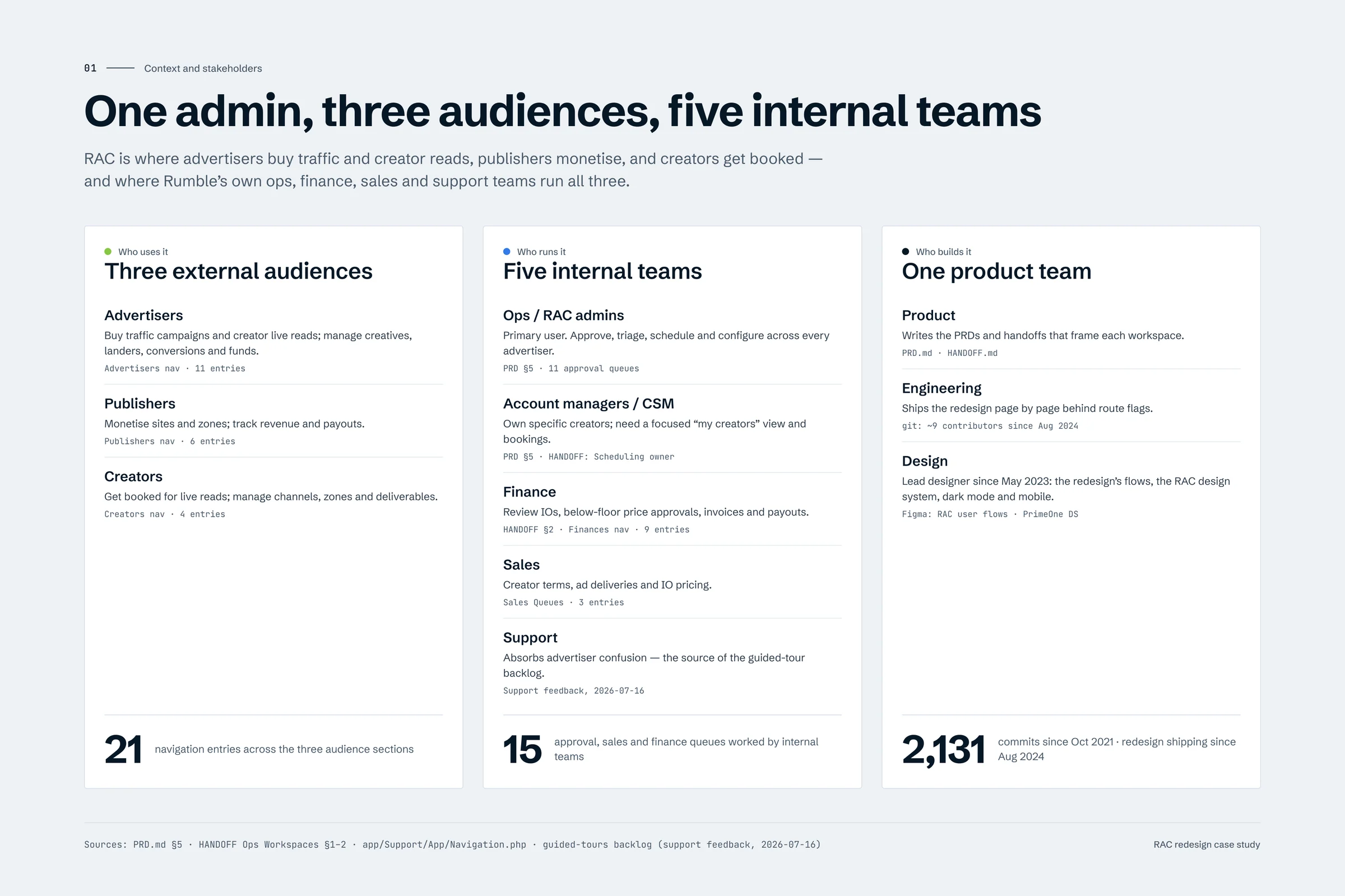
RAC is a self-serve ad platform and an internal admin in one Laravel codebase. It serves three audiences and the teams behind them:
Advertisers — run traffic campaigns and book creators for live reads.
Publishers & creators — monetise sites and zones, manage channels and deliverables.
Rumble’s own teams — ops, account managers, finance, sales and support approve, schedule and reconcile everything.
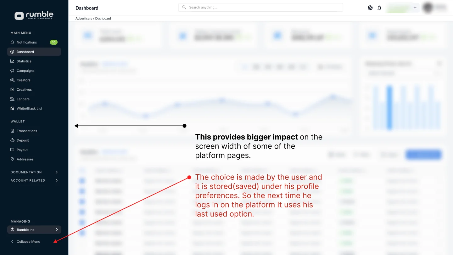
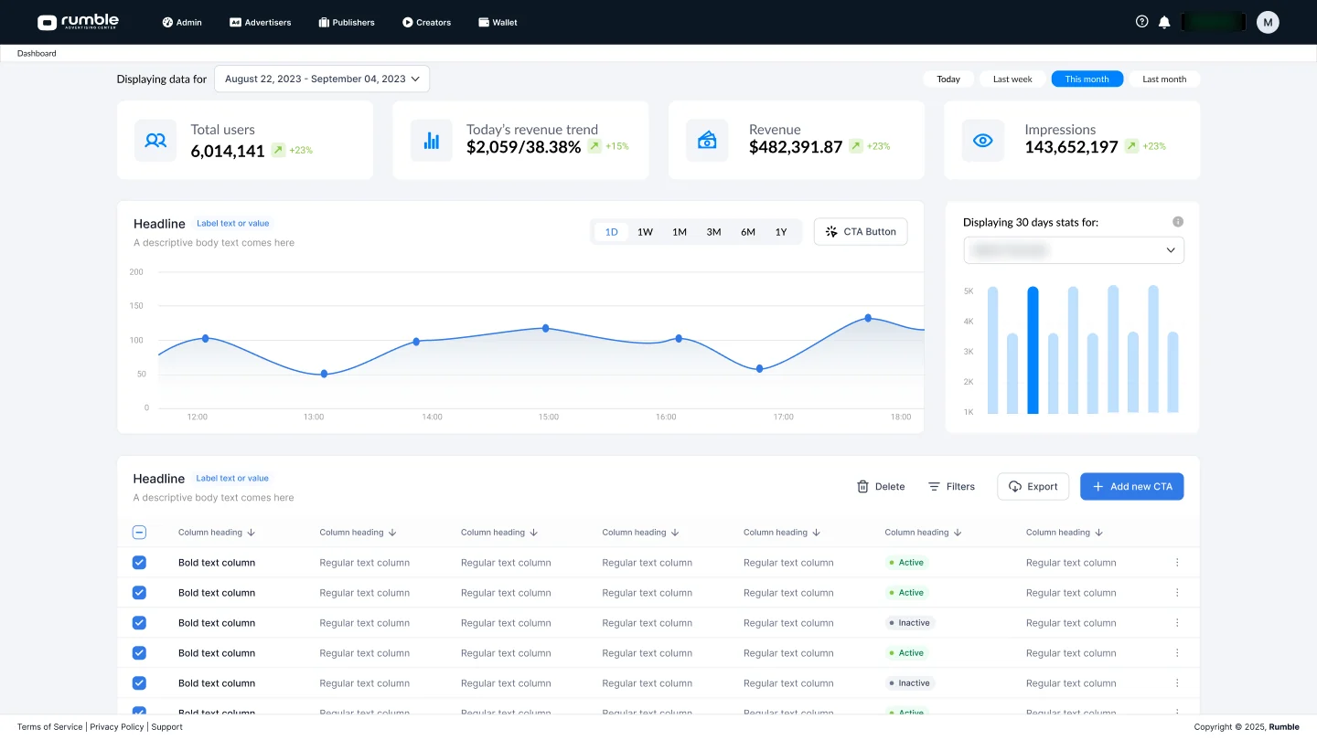
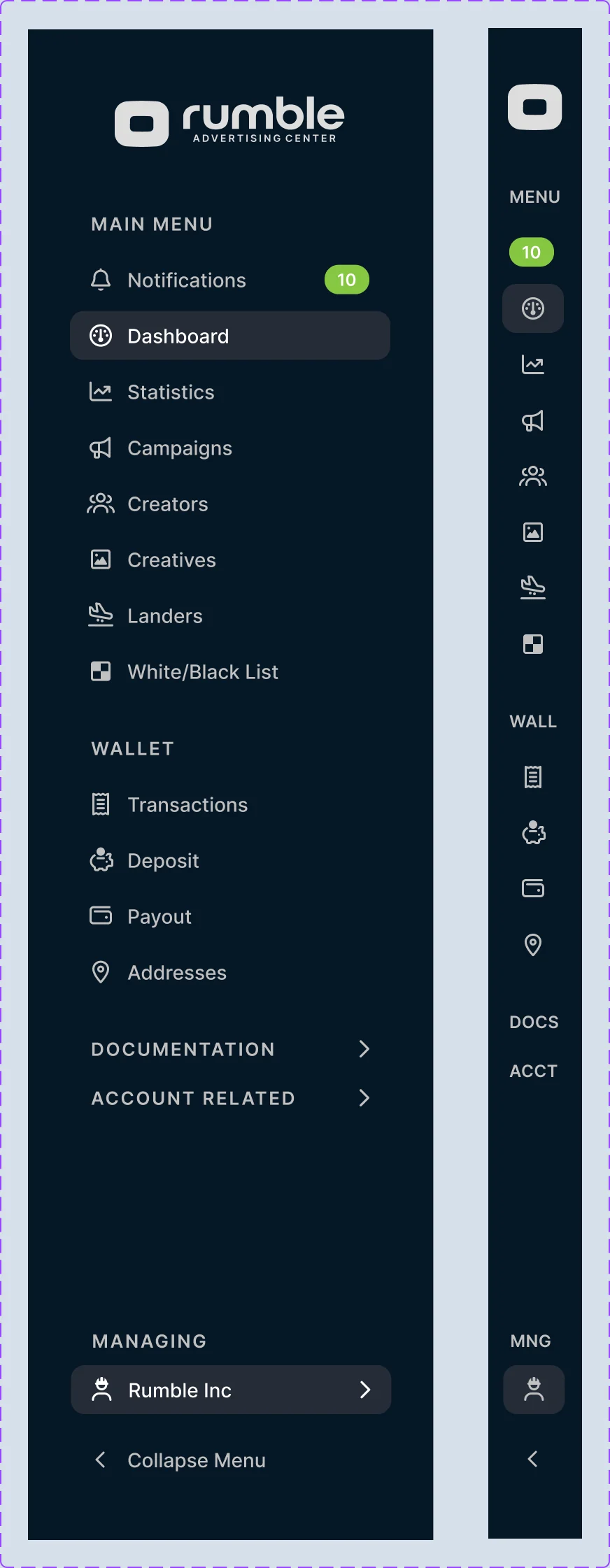
* The redesigned shell: a sidebar that holds 140 destinations, collapsible to a 67px rail. I designed it and built it myself.
Problem
The app started in 2021 on a Bootstrap 3 admin theme. Every new feature added a page, and every page solved its own layout — the stylesheet chain ended up declaring 582 colours and 38 font sizes, and the navigation grew to 140 entries.
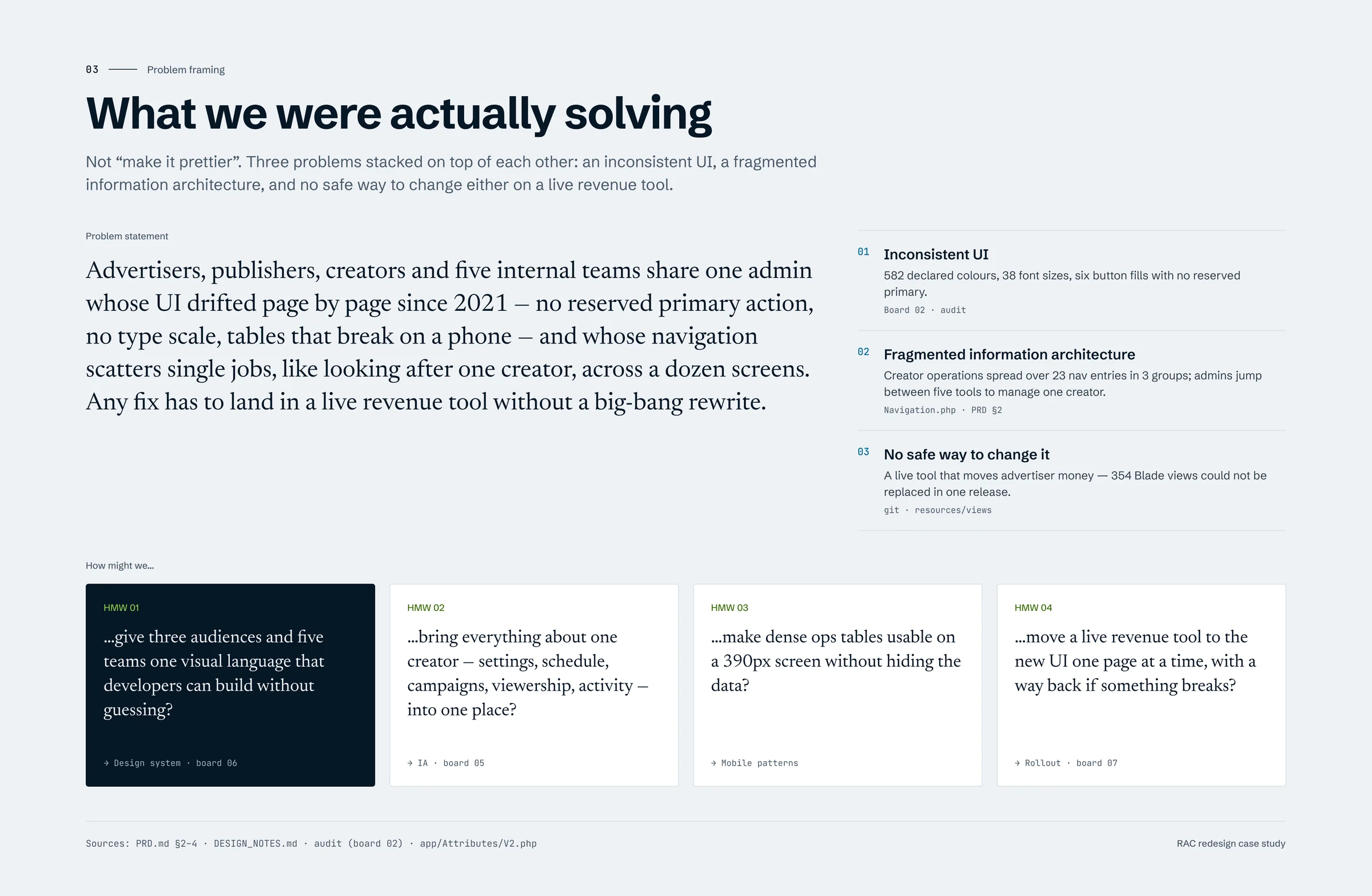
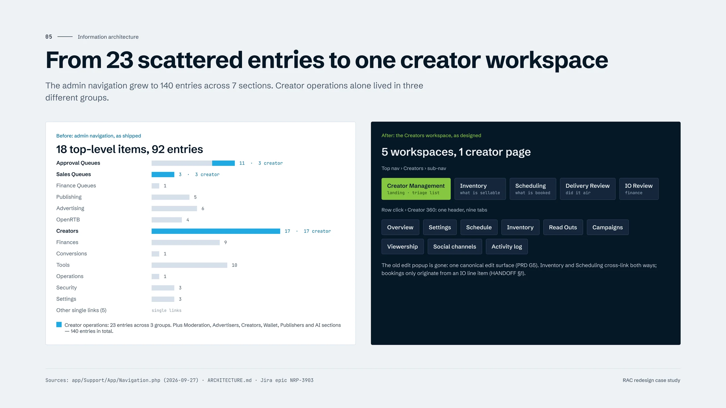
Three problems sat on top of each other: a UI that had drifted page by page, an information architecture that scattered single jobs across a dozen screens, and no safe way to change either on a tool that moves advertiser money.
Solution
Flows first, then structure, then pixels. I mapped the highest-traffic and most fragmented flows, rebuilt the information architecture around jobs, and put the visual layer on a design system that mirrors the shipped PrimeVue preset.
It ships one route at a time behind a route flag, with an escape hatch back to the classic interface — so advertisers get improvements months earlier and revenue flows never freeze.
Leading the way: design lead and decision owner
Since May 2023 I’ve owned every design and product decision on RAC — flows, information architecture, the design system, and business calls like how off-platform deliverables are priced. I also ship front-end code: the collapsible sidebar and the wallet addresses UI are mine.
Deliverables
A redesigned app shell and navigation, the core advertiser and admin flows, a creator operations workspace, and a design system that developers can build from without guessing.
119Routes live
54Colour tokens
1,310Button variants
Impact
The redesign made RAC calmer, faster to learn and cheaper to extend — without a single big-bang release.
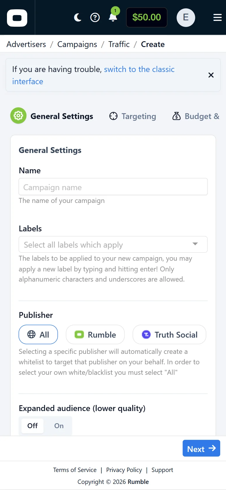
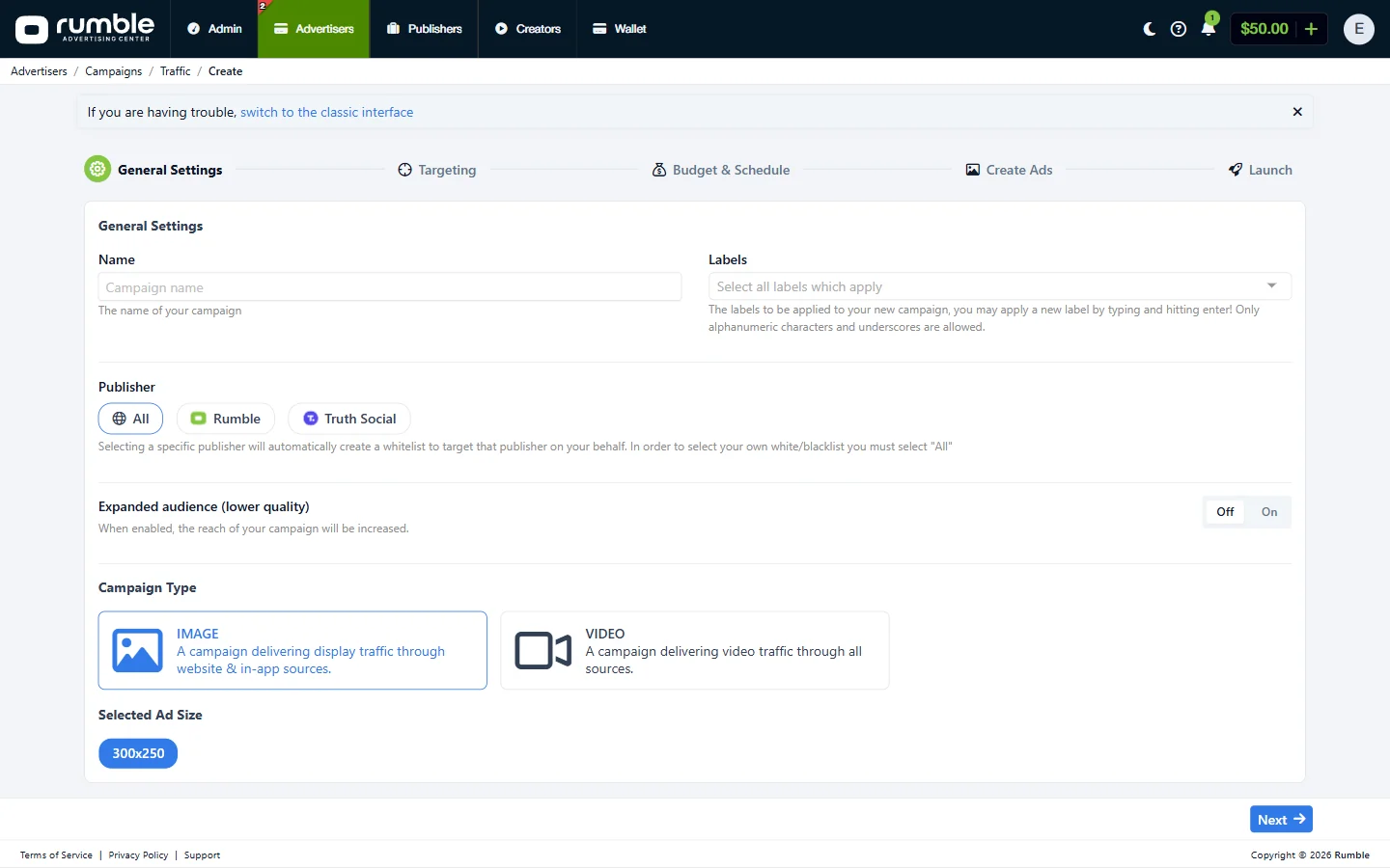
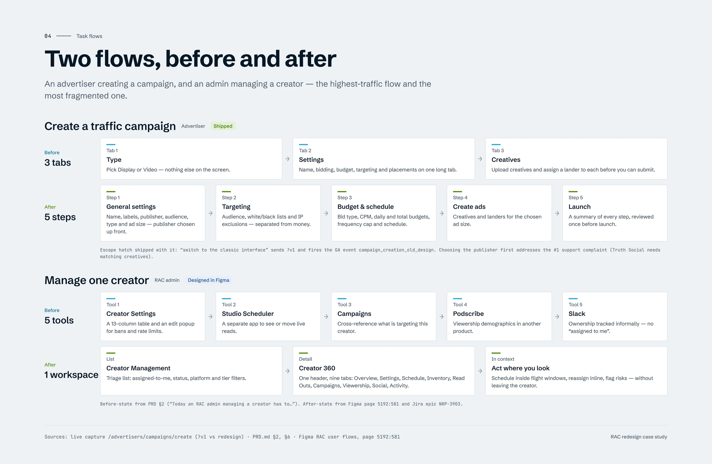
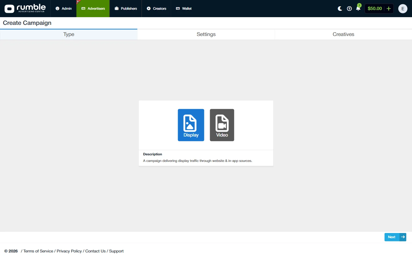
Campaign setup went from three overloaded tabs to five guided steps, with the publisher chosen first to stop mismatched creatives.
Managing a creator went from five tools to one workspace, and on pages that exist in both versions the rendered palette dropped from 40 colours to 27.
3 → 5Guided steps
5 → 1Creator tools
−33%Visual noise
Research
Before touching pixels I measured the legacy UI, and mapped who uses RAC, who runs it and who builds it.
01
UI Audit
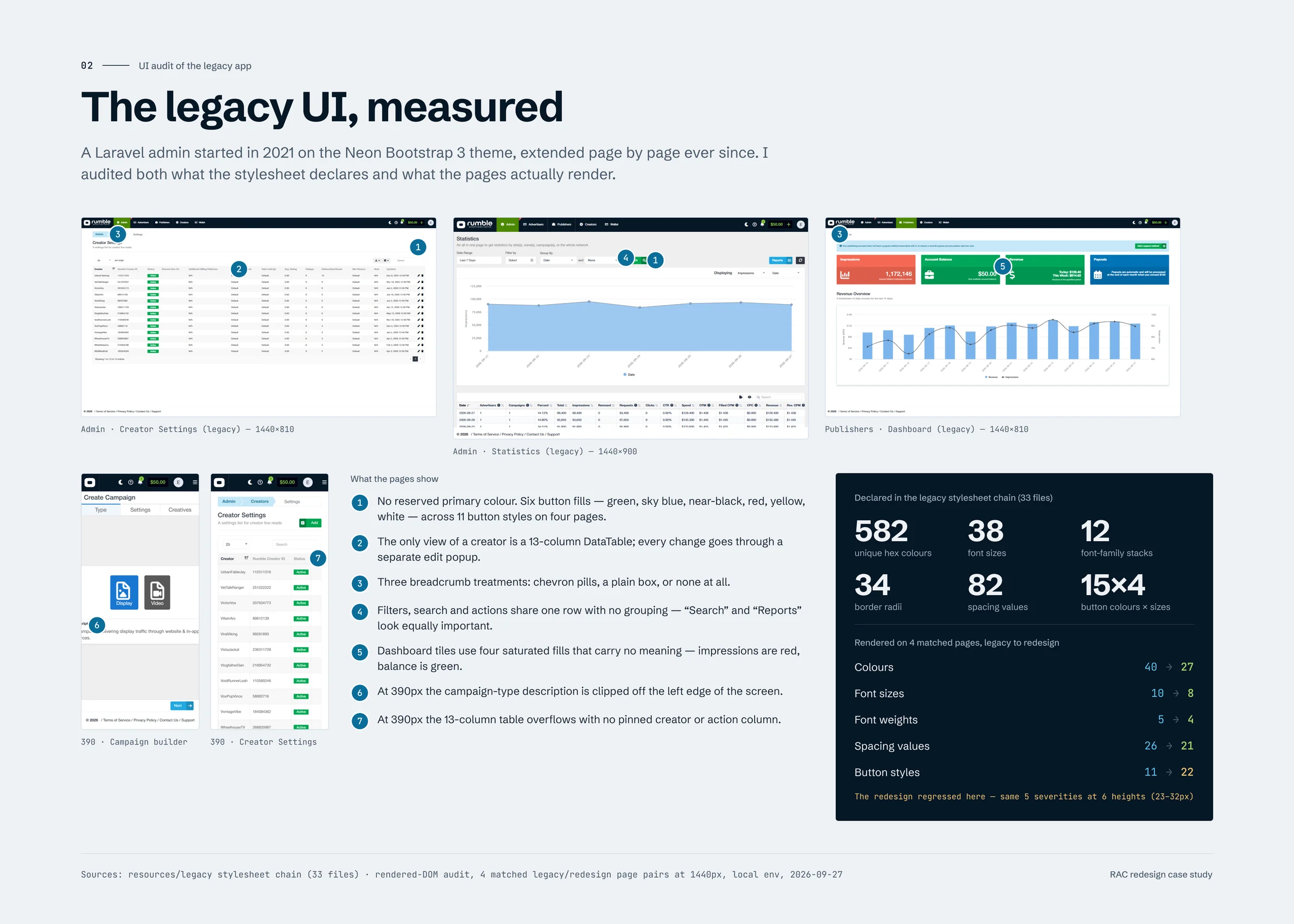
I scanned the stylesheet chain and the rendered pages that exist in both versions, at 1440px, on the same local data. Four numbers tell the story — and one honest outlier shows what the design system work still targets.
Unique colours declared
Legacy stylesheet chain (33 files) vs the RAC token collection.
582 → 54
Colours actually rendered
Union across four pages that exist in both versions.
40 → 27
Font sizes
Declared legacy sizes vs the 12 text styles in the design system.
38 → 12
Routes on the redesign
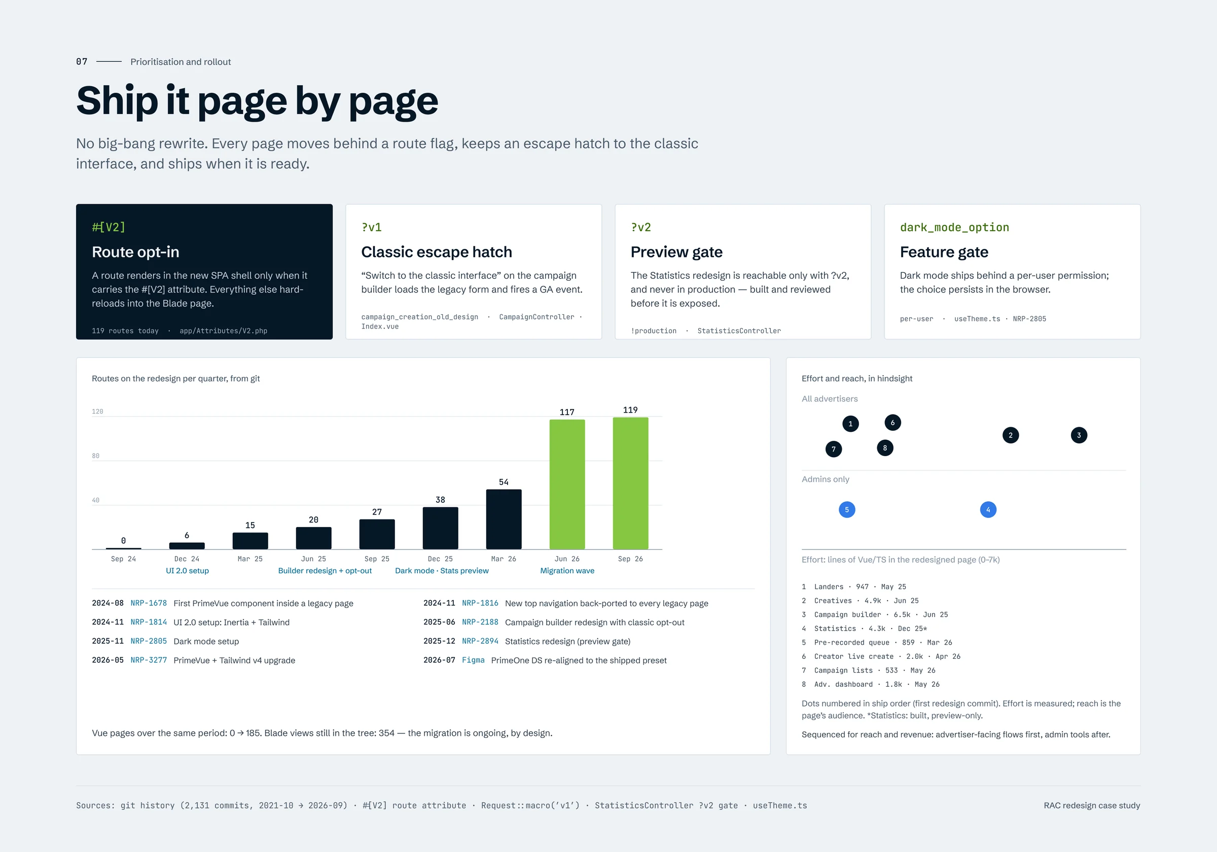
Routes opted into the new shell, Aug 2024 → Sep 2026.
0 → 119
Button styles rendered
Shipped pages still render five severities at six heights — closing that gap is exactly what the design system targets.
11 → 22in progress
02
Stakeholder Map
RAC has two kinds of users who rarely meet: the advertisers, publishers and creators who use it, and the internal teams who run it. The internal teams carry most of the complexity — 11 approval queues, 3 sales queues and a finance queue.
I worked with each group directly: ops and account managers on the creator workspace, finance on IO review and invoicing, sales on pricing, support on where advertisers got stuck, and engineering on what could ship in each release.
03
Problem Framing
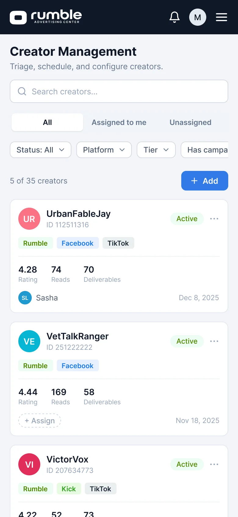
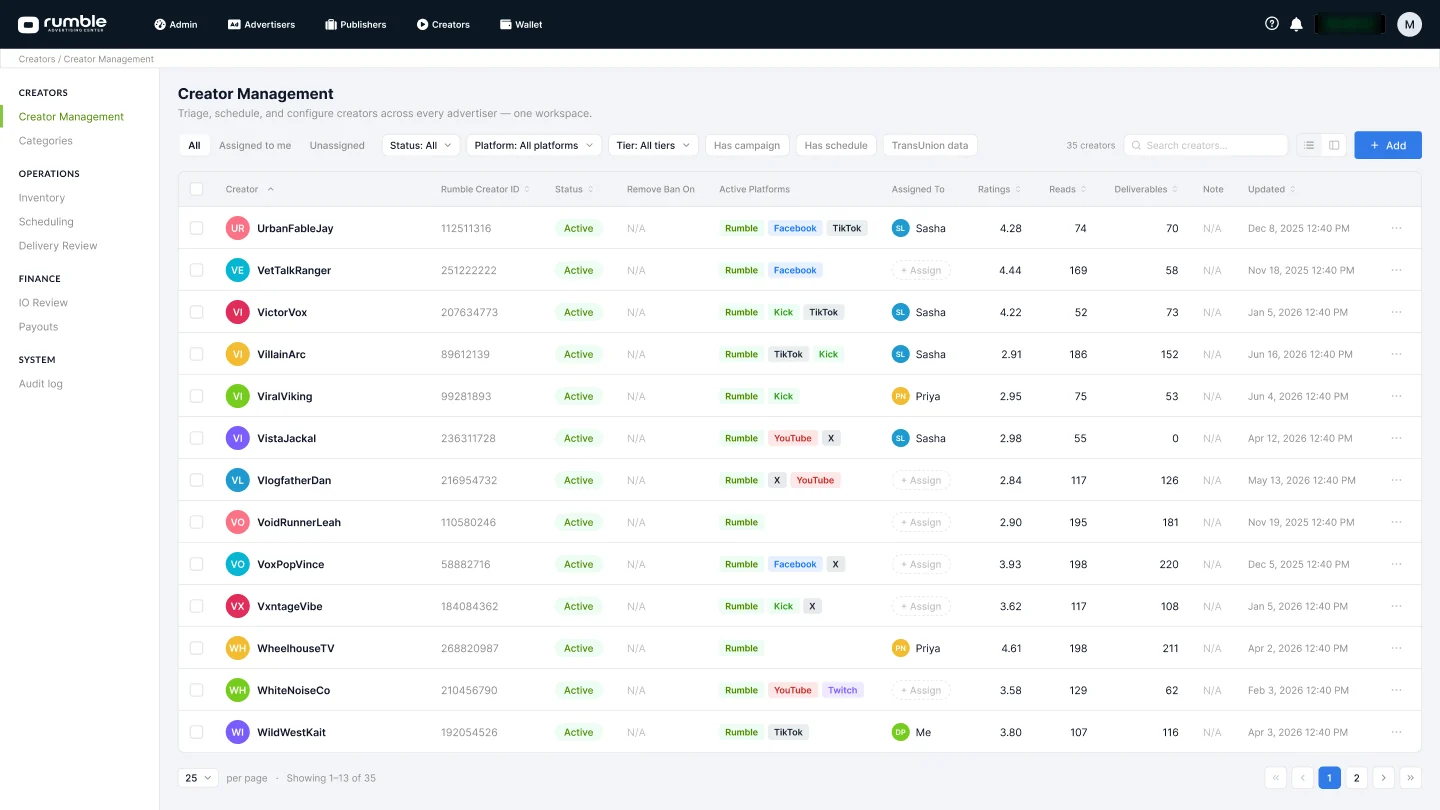
The visual drift was a symptom, not the cause. To look after one creator, an admin used a 13-column settings table and an edit popup, a separate scheduler, the campaigns list, a third-party viewership tool and Slack for ownership. Key pain points:
Visual drift: six button fills with no reserved primary colour, tiles coloured at random, three kinds of breadcrumb.
Scattered jobs: creator operations spread over 23 navigation entries in three groups.
Risky change: 354 Blade views that could not be replaced in one release.
Ideation
Flows first, then structure, then pixels — and every big call written down with the options I turned down.
04
Task Flows
I mapped the two flows that mattered most, before and after: the advertiser’s campaign builder, the highest-traffic flow, and the admin’s creator management, the most fragmented one. Three tabs became five named steps; five tools became one workspace.
05
Information Architecture
Counting where each job lived in the navigation showed that creator operations needed a workspace of their own — a triage list plus a nine-tab Creator 360 page — and that the whole app needed a navigation that could hold 140 destinations.
06
Key Decisions
Five calls shaped the redesign. For each one I weighed the realistic options and owned the choice.
Rollout
Migrate page by page behind route flags
354 Blade views, three audiences and live advertiser spend. A rewrite would have frozen the product for as long as it took.
✕
Big-bang rewriteClean result, but nothing ships until everything ships.
✕
A separate new appTwo apps to run, and users jumping between them.
✓
Page by page inside the same appA route attribute opts a page into the new shell.
Why: every page ships when it is ready, and the “switch to the classic interface” link fires an analytics event — so the fallback is measurable instead of a guess.
Pricing
Price every off-platform deliverable explicitly
Cross-posts to X, YouTube, TikTok and Instagram had nowhere to live, so a read that was already paid for started multiplying its flat rate.
✕
A free-text note on the IOInvisible to pricing and payouts.
✕
A new priced line for every postCharges advertisers twice for simple distribution.
✓
One flag per entryDistribution adds $0; a separate deliverable carries its own price.
Why: campaign totals and creator payouts stay correct, advertisers see exactly what adds cost before they commit, and sales gets a clean way to sell extra deliverables.
Design system
Rebuild the design system from the shipped code
The Figma library had drifted from what PrimeVue actually renders. Design specified one thing; development built another.
✕
Keep the old custom libraryFamiliar, but already out of step with the code.
✕
Use PrimeOne defaults as they areMatches PrimeVue’s docs, not RAC’s preset.
✓
Align PrimeOne to the RAC presetTokens, type and sizes from real usage.
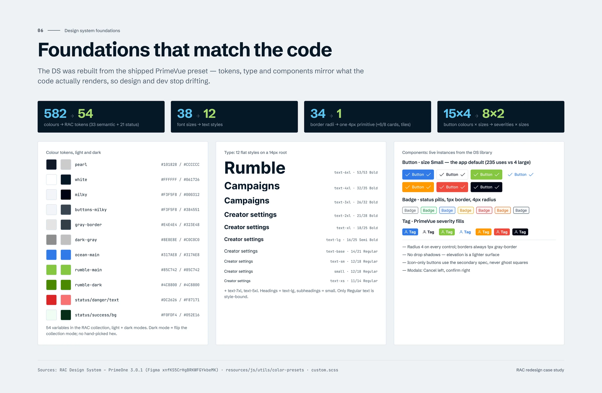
Why: developers implement PrimeVue, so designing with what they build stops drift. The app uses the small button 235 times and the large one 4 times — so Small became a first-class variant.
Structure
Give creator operations one workspace
Managing one creator took five tools, and settings were edited in a popup that duplicated the detail view.
✕
Improve the table and popupFaster, but still five tools.
✕
Add more pages under CreatorsMore entries in an already long navigation.
✓
A triage list plus Creator 360Nine tabs, one canonical place to edit.
Why: ownership, scheduling and campaign context belong next to the creator they describe — fewer tool switches, faster triage.
Mobile
On mobile, keep the table and pin the actions
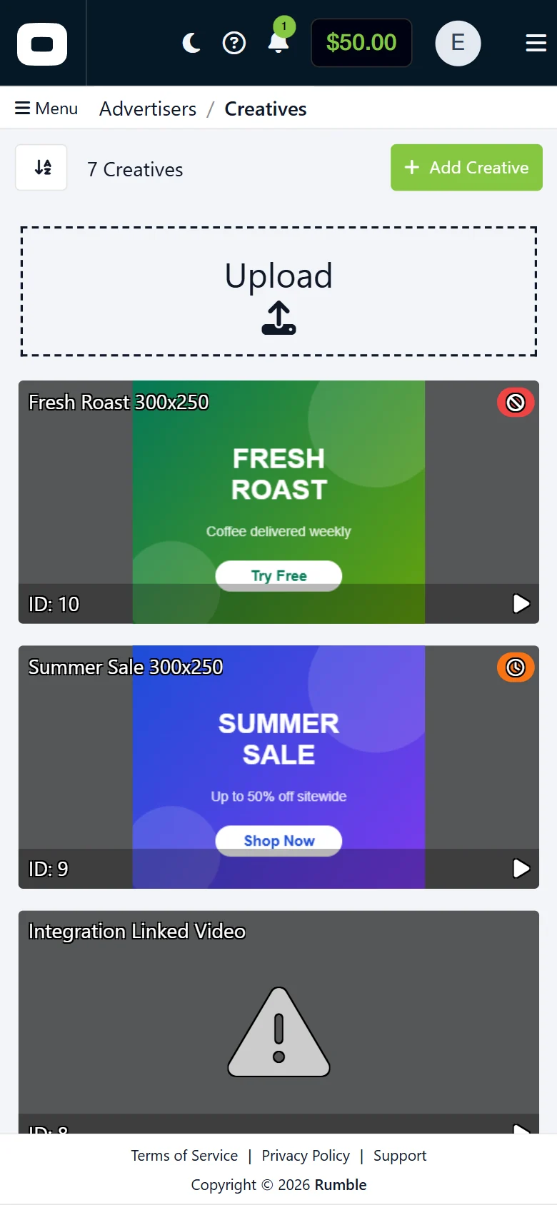
Ops tables have 10 to 16 columns. At 390px the legacy tables simply overflow.
✕
Hide columns on small screensThe hidden column is always the one someone needs.
✕
Turn every row into a cardReadable, but rows stop being comparable.
✓
Scroll the table, pin the actionsStatus and amount sit in the first viewport.
Why: data stays comparable, it matches how production freezes columns, and it gives one rule for every table in the product.
Design
A design system that mirrors the code, then the product, screen by screen.
07
Design System
The RAC collection holds 54 colour variables with light and dark modes, so dark mode is a mode switch rather than a second palette. Twelve flat text styles mirror the app’s 14px root. Buttons, badges, tags and tables are components with the variants the code actually uses.
Two rules came out of real mistakes: surface tokens that match in light mode but diverge in dark are named by role, and every regular-weight text is bound to a style — because “looks right” is not the same as “will stay right”.
08
Before & After
Each pair shows the same data at the same scroll position. Drag the handle to compare the legacy page with the redesign.
BeforeAfter
09
Sidebar Navigation
The legacy app hid 140 entries behind five top-level dropdowns. The redesign moves navigation into a sidebar grouped by job, with notification counts and an account switcher for agencies. It collapses from 290px to a 67px icon rail, giving tables and charts 223px back, and remembers the choice. I designed it and built it myself.
Before: five dropdowns carried every destination.The expanded drawer in context.Expanded 290px and collapsed 67px states.
10
Creative Folders & Campaign Linking
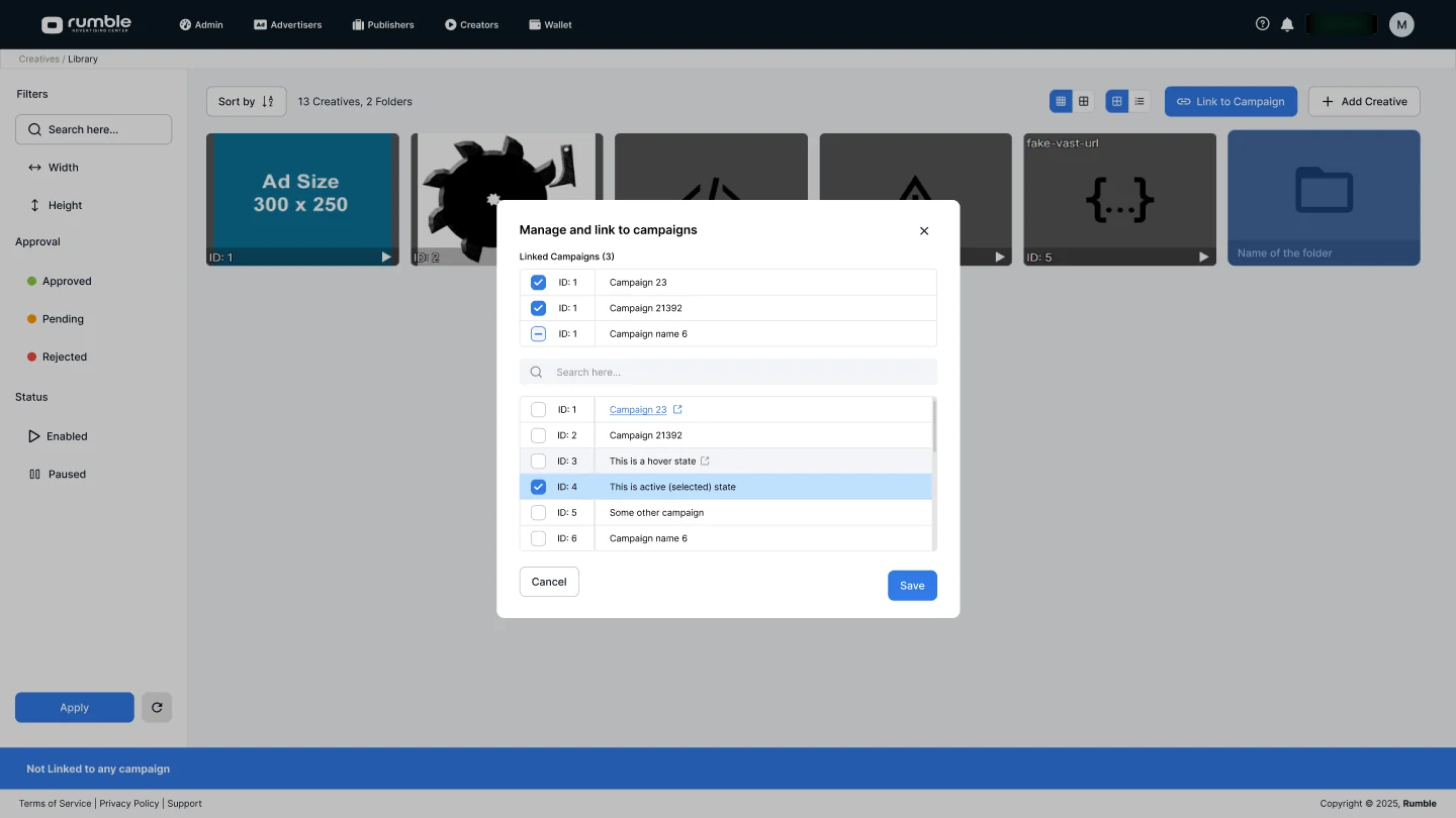
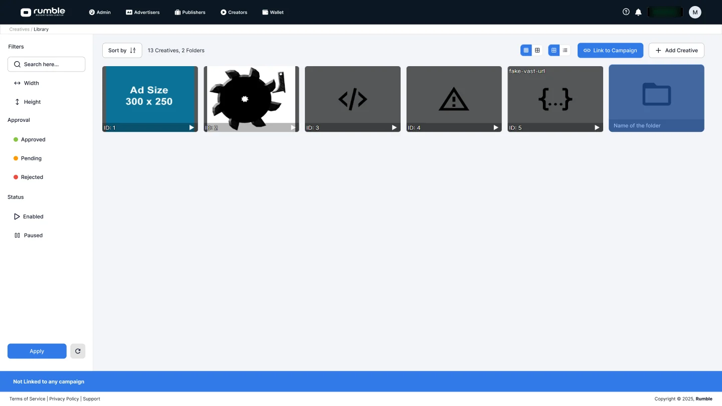
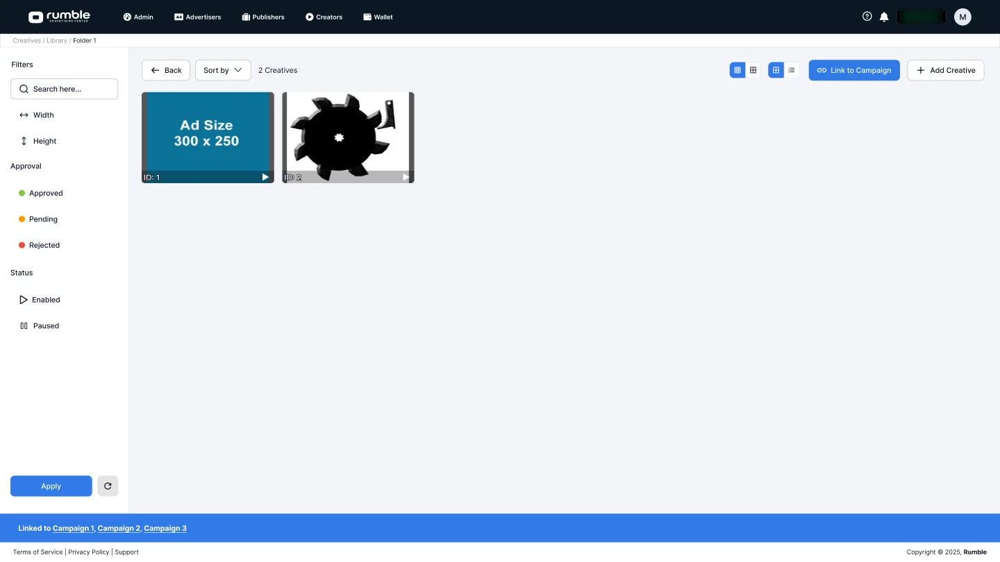
Creatives lived in one flat grid and could only be attached from inside a campaign. Now advertisers link creatives to one or many campaigns straight from the library, see at a glance where each one runs, and organise the library into folders. Linking shipped in June 2025.
The library, with folders and a Link to Campaign action.Link or unlink campaigns in one dialog.Inside a folder, every linked campaign at a glance.
11
Global Search, by Role
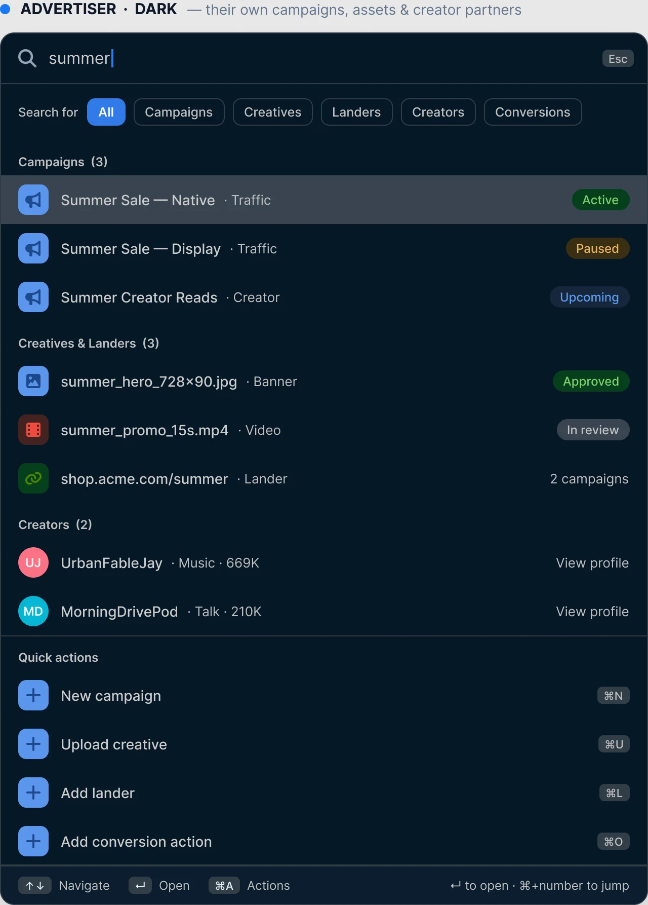
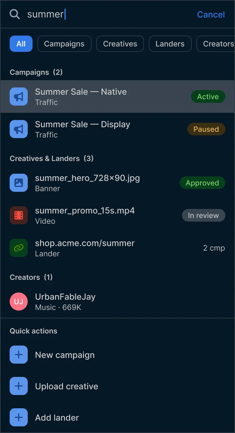
Finding a campaign, a creative or a user meant knowing which of 140 pages it lived on. One search field in the top nav, opened with ⌘K, now returns results and quick actions based on who is searching — advertisers see their own campaigns and creatives; admins search users, sites and approval queues across the platform.
The entry point: ⌘K from anywhere.Advertiser results, dark mode.On a phone, a full-screen sheet.
12
Rollout
Four switches make the incremental rollout work: a route attribute that opts a page into the redesign, an escape hatch back to the classic interface, a preview gate for unfinished pages, and a per-user permission for dark mode. I sequenced the work for reach and revenue — advertiser flows first, admin tools after — and routes on the redesign went from 54 to 117 between March and June 2026.
Reflection
13
Impact
The redesign laid the foundation for everything RAC ships next — measured, not guessed:
119
Routes live
From zero in August 2024, without a single big-bang release.
−33%
Visual noise
Rendered colours down from 40 to 27 on pages in both versions.
3 → 5
Campaign setup
Three overloaded tabs became five guided steps.
5 → 1
Creator operations
Five tools for one creator became one workspace.
54 · 12
Design system
Colour tokens and text styles matched to the code.
$0
Pricing leak
A paid read can no longer multiply its flat rate.
+223px
Screen space
The collapsible sidebar hands data-heavy pages more width.
Shipped
Dark mode
Same tokens as light, so every new page gets it for free.
14
Timeline
I join as lead designer of RAC; dashboards redesigned for all four roles.
New top navigation on every legacy page; the redesign’s app shell goes in.
Creatives with campaign linking, and the campaign builder with its classic-interface escape hatch.
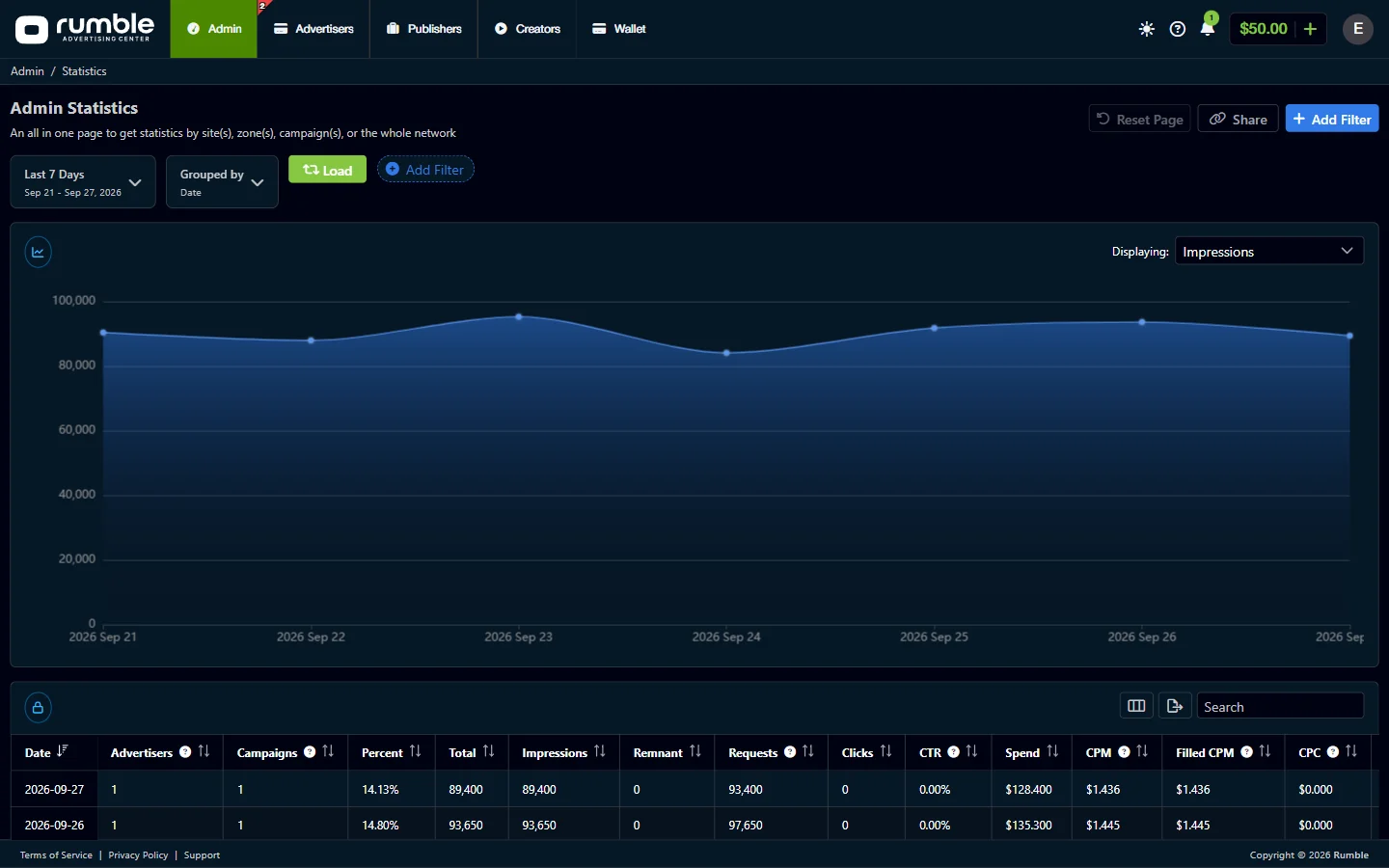
Dark mode, behind a per-user permission.
Collapsible sidebar, designed and built by me; the migration wave begins.
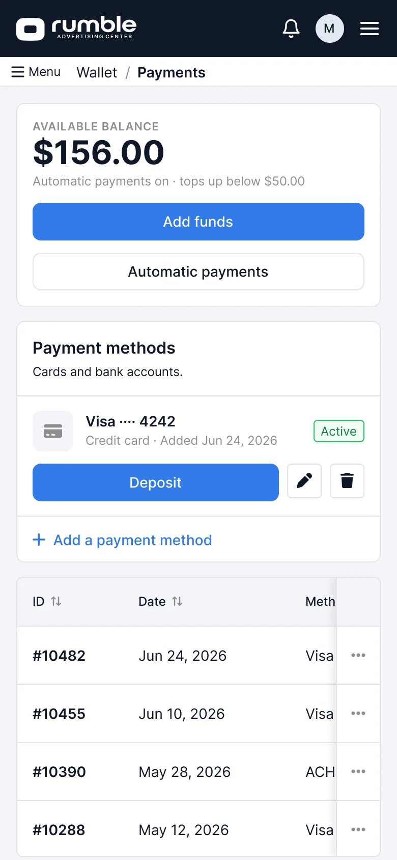
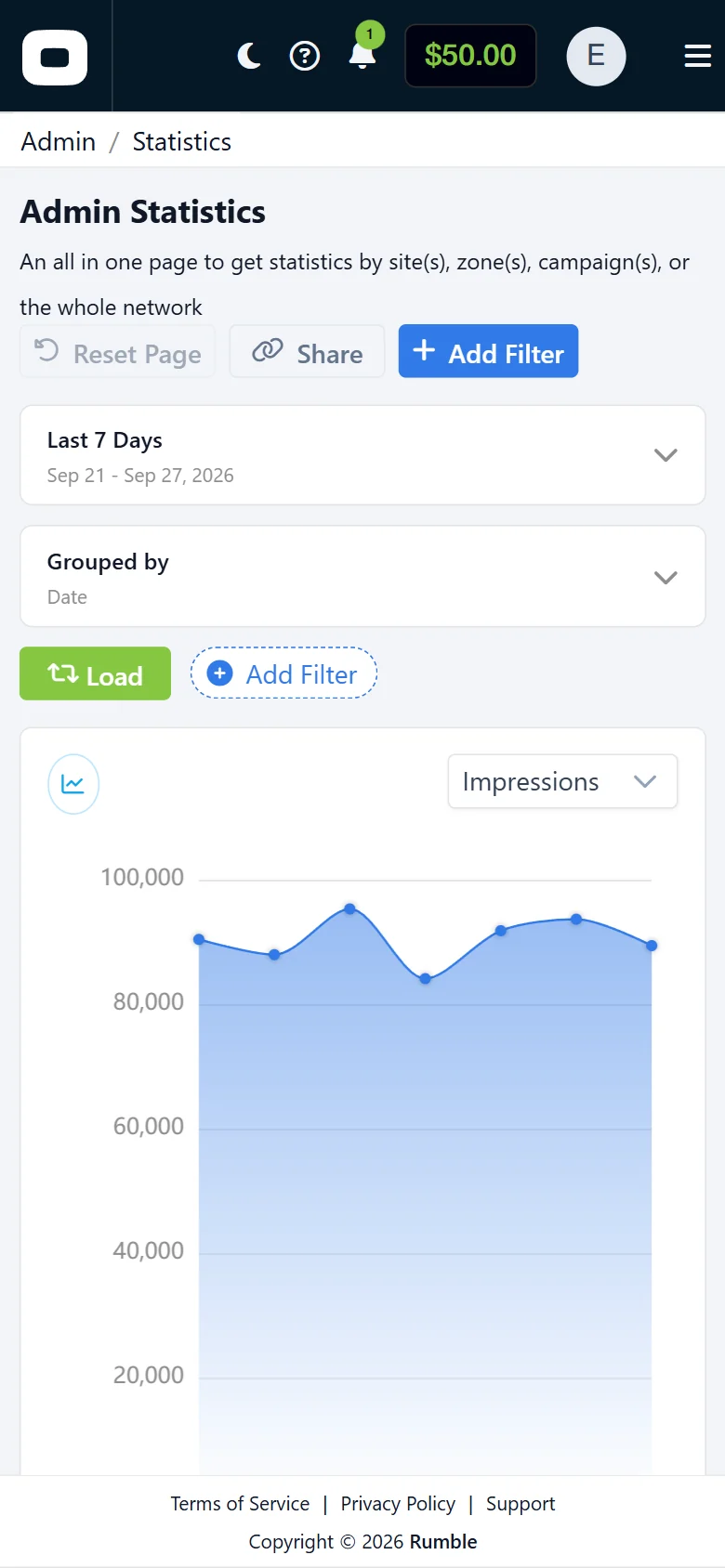
Design system re-aligned to the shipped preset; Wallet, Statistics and global search designs.
Off-platform deliverable pricing; Creator 360 across all nine tabs.
15
What I’d Do Differently
Name surface roles before dark mode
Two tokens were identical in light and opposite in dark. Defining “recedes” and “rises” surfaces first would have saved a sweep of 192 cells.
Publishing the library is part of done
A dark-mode value changed in the source but was never published. A release step with a changelog closes that loop.
Mobile rules before mobile screens
A scrolling tab strip shipped on 13 frames before the rule — the menu, never a tab strip — was written down.
Measure the baseline first
The escape hatch was instrumented from day one, but task time wasn’t captured beforehand. Next time the baseline comes first.