One-tap on-device install
Why: QR codes assume a second device or a printout — absurd for a mobile-first product. The harder engineering path removes the single biggest drop-off moment in the category.
A travel eSIM app with no roaming bills and no surprises — 197 countries, transparent daily pricing, and a one-tap install that skips the QR-code ritual.
View Live Project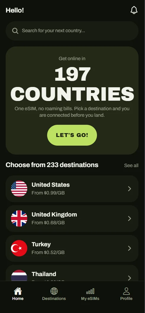
Travel eSIMs are sold by resellers with murky pricing, QR-code installs, and plans that expire the moment you need them.
Clear Roam is a global data eSIM app: pick a country or a regional plan, install once, and you're online before you land — no physical SIM, no contract, no roaming bill. The brief I set myself: take a category dominated by reseller apps with confusing pricing and clunky QR-code activation, and make it feel as simple as buying a coffee — while building the whole thing solo under Bearacle.
The eSIM market has a trust problem. Most apps are thin wrappers over the same wholesale providers — prices hide behind currency games, coverage claims are vague, activation means fiddling with QR codes at the gate, and unused data quietly expires. The design challenge: make every number legible before purchase, make activation disappear, and structure a catalogue of 233 destinations so the right plan is three taps away — on a solo budget, across three platforms.
Everything — product strategy, brand, UX/UI, and the Expo + Supabase build itself.
A working development build covering 197 countries and 233 destinations — price-before-you-buy checkout, one-tap install, live usage tracking.
How I approached it, step by step.
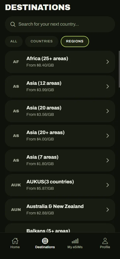
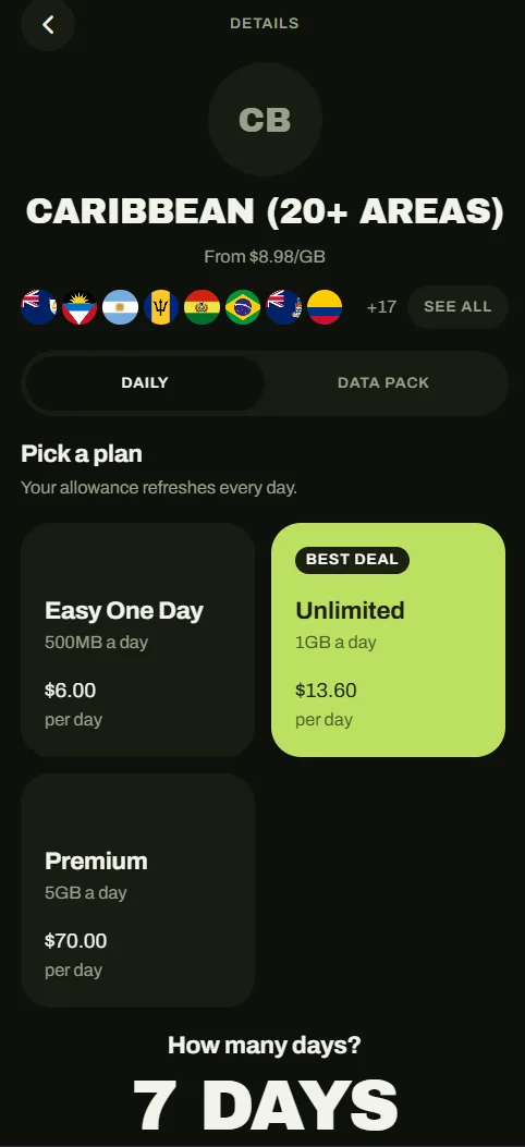
The home screen is the catalogue: search a country, see the starting price per GB immediately. Destinations, regional bundles, and global plans share one predictable card pattern, so browsing 233 destinations feels like one mental model, not three.
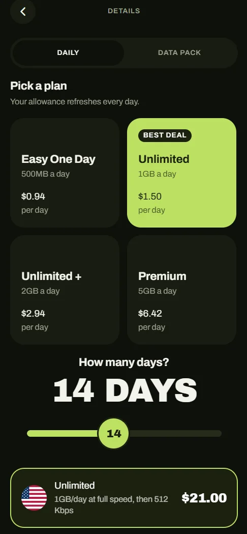
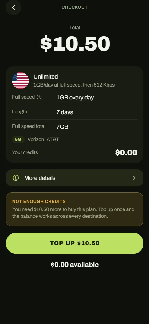
Every plan shows its full cost up front: daily allowance, duration slider, and the exact total recalculated live before checkout. Daily plans and one-off data packs sit side by side on the same screen so the trade-off is visible, not buried.
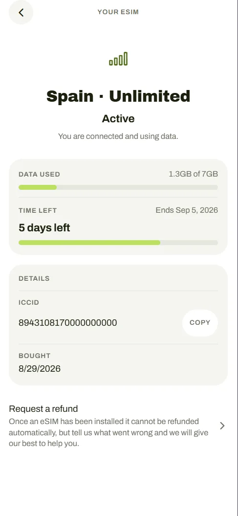
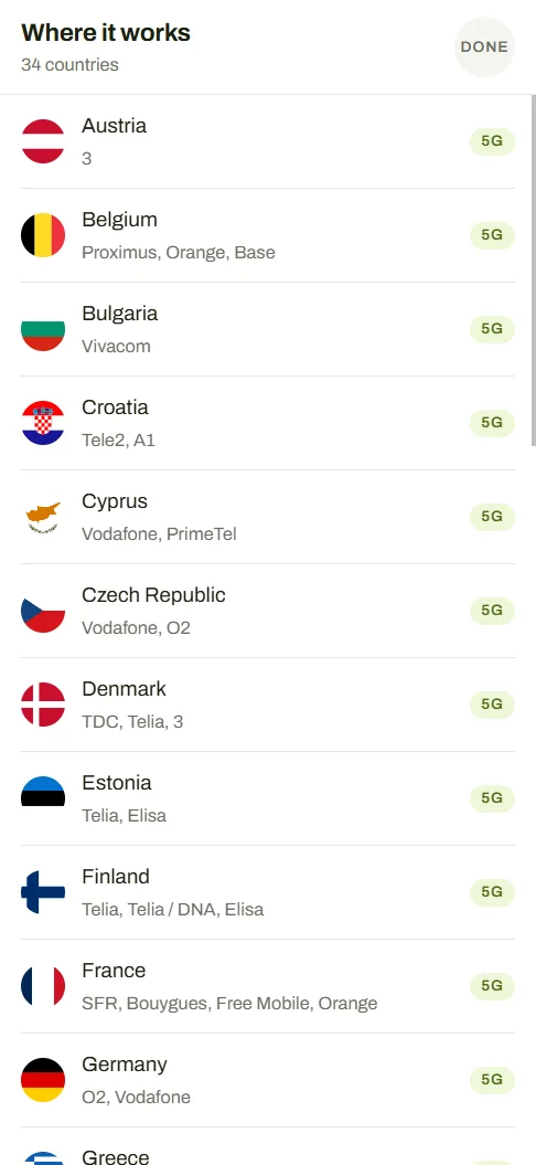
The classic eSIM flow — screenshot a QR code, open settings, scan it from another device — is where most users give up. Clear Roam installs the eSIM with a single tap on-device, and the 'My eSIMs' surface shows live usage, named real networks, and low-data alerts.
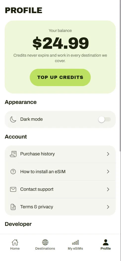
Instead of forcing a card payment per trip, an account credit balance carries over — topped up once, spent across trips. Refund requests are a first-class flow in the app, not a support email.
Every design is a set of choices. These were the big ones.
The options I weighed, and why I chose what I did.
The shipped screens, and what changed.
A closer look at the final design.
Clear Roam is in active development under Bearacle, with a working build across iOS, Android, and web — full catalogue, checkout with credits, one-tap eSIM delivery, live usage tracking, and light & dark themes. The catalogue currently covers 197 countries and 233 destinations while coverage partners are finalised. Launch date: when it's ready.
In low-trust categories, transparency is the differentiator — showing the price math is worth more than any brand promise.
The install moment is the product. If activation fails at the airport, nothing else matters.
Designing and engineering the same product keeps both honest — no feasibility surprises, no design debt.
Clear Roam is the most 'full-stack' thing I've built — catalogue data, payments, telecom APIs, and a consumer-grade UI, all solo. The discipline it forces: every feature has to justify both its design cost and its engineering cost to the same person. If I could restart, I'd lock the pricing model before designing a single screen — pricing shape leaks into every surface, and I redrew the plan picker three times learning that.