A clear, predictable UX built around readability and focus
Startup·UX/UI·Fintech·Archived
Designing a data-driven fintech experience built specifically for tablet users and Windows desktop software under tight time constraints — an MVP shipped in roughly two weeks, without existing user data.
Role
Lead Product Designer
Team
Founders, Engineering
Tools
Figma
Whimsical (flows)
Figma prototyping
Notion (handoff doc)
Timeline
≈ 2 weeks (MVP launch)
Tablet · Windows Desktop
Overview
Early-stage fintech needed a credible MVP purpose-built for tablet and Windows desktop in roughly two weeks — no user data, no analytics, no PM in the loop.
A clear, predictable UX built around readability and focus
Design an MVP fintech product that presents financial data, statistics, and insights in a clear and accessible way — built specifically for tablet users and as software for the Windows desktop, within a very limited timeframe and without existing user data.
Challenge
Guardian Wealth was an early-stage fintech startup aiming to launch a data-heavy product focused on financial statistics and insights — built specifically for tablet users and as dedicated software for the Windows desktop, not a generic site stretched across every screen. The main challenge: design a credible, usable fintech experience in roughly two weeks, without real user data, analytics, or validated assumptions. Decisions had to balance clarity and trust while remaining flexible for future product growth.
My role: Lead Product Designer
Lead Product Designer. Owned UX strategy, MVP definition, hierarchy, the Windows desktop build, and developer handoff.
UX strategy & MVP definition
Information hierarchy
Tablet-first design approach
Windows desktop application design
Design system updates
Developer handoff & documentation
Deliverables
Strategy
UX Strategy
Product Strategy
MVP Definition
Information Hierarchy
Tablet + Windows Desktop Approach
Design
UX Design
UI Design
User Flows
Wireframing
High-Fidelity UI
Design System Updates
Prototyping
Windows Desktop Application
Developer Handoff
Documentation
~93%Clarity score (early users)
≈ 2 weeksTimeline
Tablet · DesktopPrimary form factors
2020Year
Impact
~93% of early users reported the interface was clear and helpful for understanding financial information.
Process
How I approached it, step by step.
01
Decision-driven, not committee-driven
Due to the short timeline, the work was highly collaborative and decision-driven. I worked directly with stakeholders and engineers, translating business requirements into structured user flows and validating ideas through frequent internal reviews. Without a PM, I owned prioritization and design decisions.
02
Two form factors, not one shrunk to fit
The product lived in two real contexts: a tablet for checking finances away from a desk, and Windows desktop software for the deeper working session. Instead of one responsive layout stretched between them, each got its own hierarchy, density, and navigation tuned to how it was actually used — held in a lap versus driven by a keyboard and mouse in a full window.
03
Information hierarchy
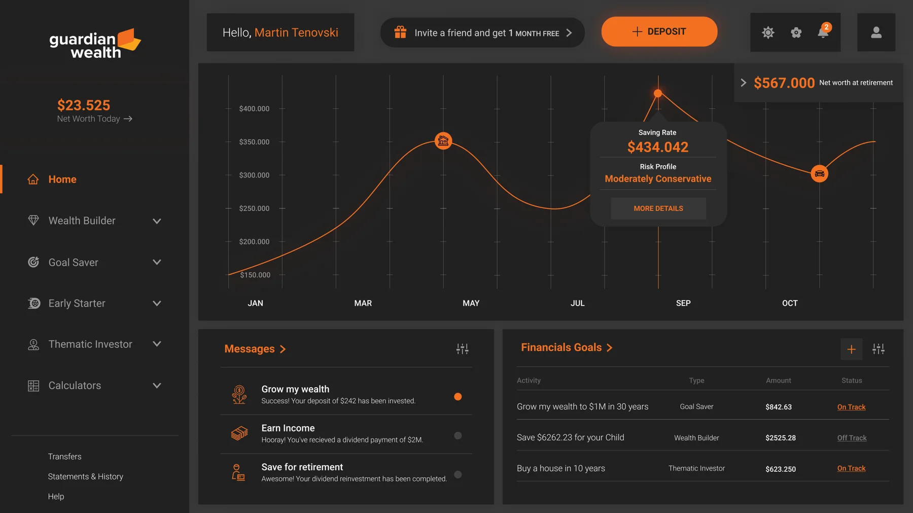
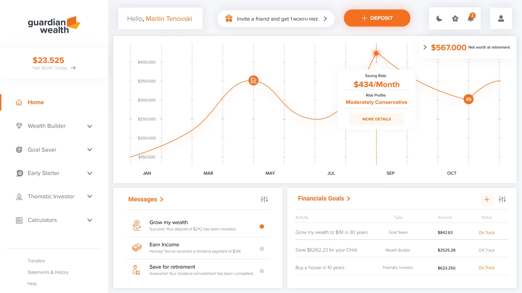
Clear hierarchy, readable data presentation, consistent interaction patterns. Complex financial information could be understood at a glance, with depth available on demand.
04
Production-grade handoff
Design system updated, the Windows desktop build fully specced, prototypes documented. Engineering shipped without ambiguous handoffs even under the compressed timeline.
Decisions
Every design is a set of choices. These were the big ones.
05
Trade-offs I made
The options I weighed, and why I chose what I did.
Decision 01
Software built specifically for tablet and Windows desktop
✕
A responsive web app stretched across every screenConsidered instead
Why: The user persona reviewed finances two ways — on a tablet during a break, seated at a Windows desktop workstation during a real session. Neither is a phone-in-pocket moment. Designing natively for those two contexts, instead of one generic responsive layout, kept every screen sized to how it would actually be used.
Decision 02
Hierarchy and readability over density
✕
Heavy charting and data densityConsidered instead
Why: Without user research validating density tolerance for the specific persona, clarity beats packing. Better to ship a legible MVP than an overwhelming one that needs rework.
Decision 03
Update an existing system in place
✕
Build a full design system from scratchConsidered instead
Why: Two-week MVP timeline. Reuse over novelty — the system needed to support the product, not be the product.
Design
The shipped screens, and what changed.
06
Screens
A closer look at the final design.
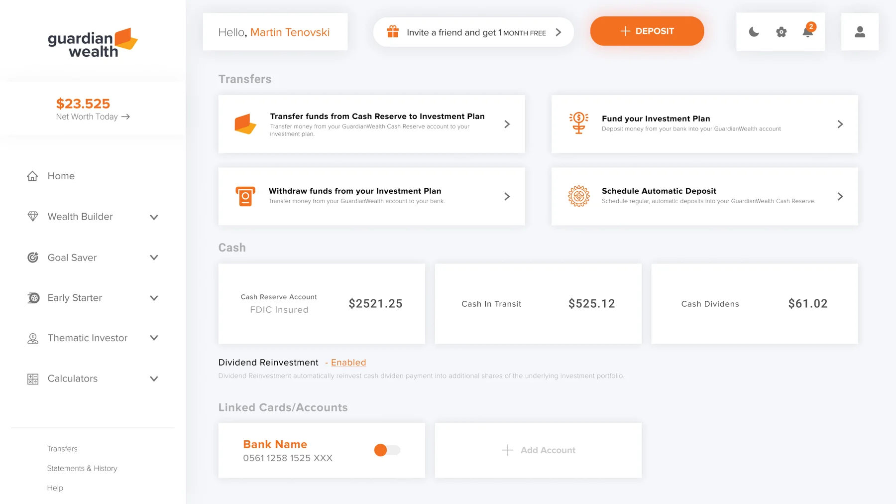
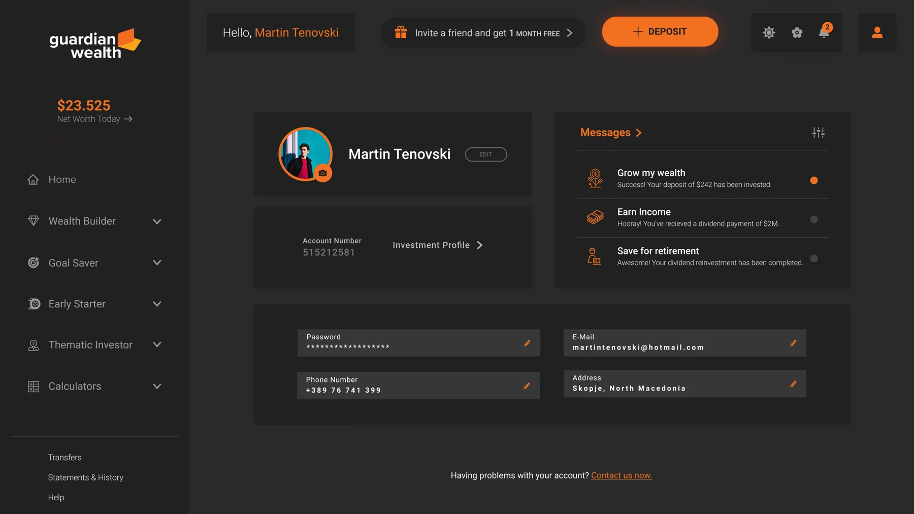
Home dashboard — dark modeHome dashboard — light modeTransfers — readable financial data at a glanceProfile — community + personal finance combined
Reflection
In the first six months after launch, ~93% of early users reported the interface was clear and helpful for understanding financial information. Although the startup later ceased operations for financial reasons, the product successfully demonstrated its design and usability goals. The biggest learning: speed has to coexist with strategic thinking, and product designers should be involved in business-level discussions early — not just design outcomes.
07
Looking back
Speed without strategy ships pretty pixels. Speed with strategy ships products. Guardian Wealth taught me that being decision-driven (not committee-driven) is a Lead's job under compressed timelines — and that designers belong in the business conversation, not just at handoff. The startup didn't survive for non-design reasons, but the product itself shipped sharp on a brutal timeline. That's the part I keep.