My personal brand. A clear, minimal, professional visual identity built around a Slavic childhood nickname — Mechka, the bear.
Role
Designer
Solo
Team
Solo project
Tools
Figma
Adobe Illustrator
Print mocks
Type foundry trials
Timeline
Personal project
Identity · Web · Print
Overview
Translate years of product design work into a personal identity that wouldn't recycle the discipline's visual clichés.
A bear, a name, a story
Design and define my personal brand by creating a clear visual identity and digital presence that communicates my experience, values, and design approach in a concise and professional way — optimized for portfolio and personal website use.
Challenge
Translating a body of product design work into a personal brand without leaning on the visual clichés the discipline tends to recycle. The system had to feel mature, restrained, and unmistakably mine — and to carry a story worth telling.
My role: Designer · Solo
Solo — brand strategy, naming, mark, type system, application across web, print, and merchandise.
Deliverables
Strategy
Brand Strategy
Identity Direction
Naming & Story
Design
Graphic Design
Art Direction
Branding
Brand · IdentityDiscipline
End-to-endScope
2020Year
LiveStatus
Impact
One identity carrying every project, deck, and presentation since 2020 — and the foundation this site builds on.
Process
How I approached it, step by step.
01
Starting with a story
In my Slavic tradition, everyone gets a nickname around the age of 10. Mine? Mechka — which means bear. Over the years, it stuck. Friends, colleagues, clients all know me by it. So when it came time to create my personal brand, choosing the bear felt natural. The bear isn't just a logo — it's a conversation starter.
02
Foundations
A tight color palette, a typographic scale, and a grid that would carry through every surface — site, deck, and printed material.
03
Mark & identity
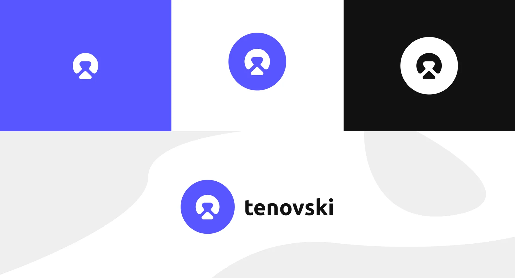
Wordmark and supporting marks that read at any size — from a 16px favicon to a billboard-scale title. The bear motif anchored the system.
04
Application
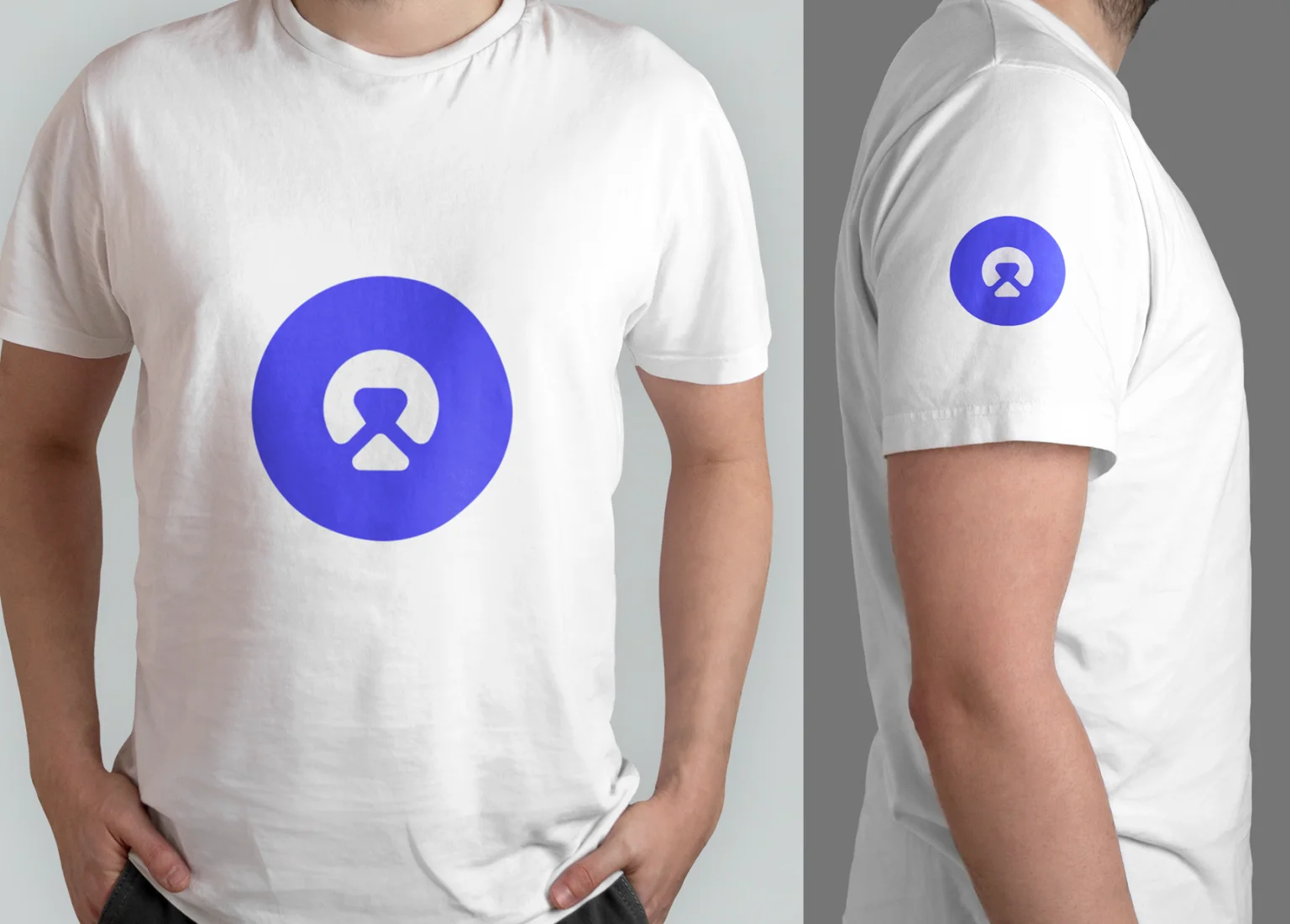
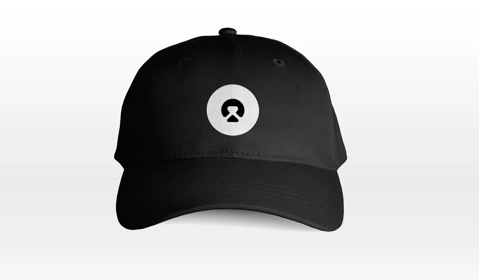
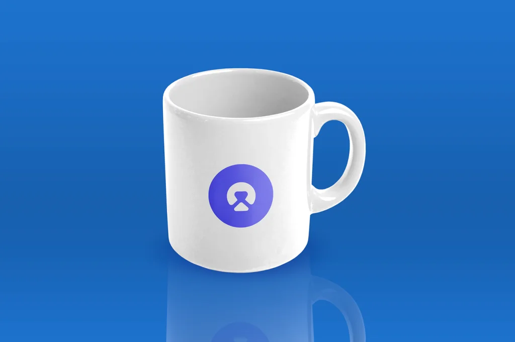
Applied across portfolio site, social, decks, print, and merchandise to confirm the foundations held under real-world use.
Decisions
Every design is a set of choices. These were the big ones.
05
Trade-offs I made
The options I weighed, and why I chose what I did.
Decision 01
The bear, anchored in a personal Slavic tradition
✕
An abstract minimal mark — the safe portfolio defaultConsidered instead
Why: A logo without a story doesn't survive — it gets redesigned every two years because there's nothing holding it down. Mechka has carried 15 years of memory before becoming a logo, and that's what makes it durable.
Decision 02
Restrained sans-serif (Inter)
✕
Bold serif display type as the headline voiceConsidered instead
Why: The work is product design; the brand should disappear in front of the work, not compete with it. Loud type on a portfolio undermines the work it's framing.
Design
The shipped screens, and what changed.
06
Screens
A closer look at the final design.
Wordmark and supporting marksType system and gridBrand applied to merchandise — capBrand applied to merchandise — mug
Reflection
A clean, minimal identity that's served as the umbrella for every project, deck, and presentation since 2020 — and the foundation this site builds on.
07
Looking back
Personal brand is a multi-year decision, not a redesign cycle. The system held up across portfolio shifts, professional changes, a studio launch (Bearacle), and now this site. The lesson is the boring one: build the foundation tight, and resist the urge to redesign it every two years just because tools changed. Restraint is the brand.