Hierarchical IA with predictable, repeatable patterns
Why: Clinicians under time pressure value predictability over flexibility. Faceted search is powerful but cognitively expensive — wrong tool when seconds matter during patient consultations.
Making critical medical information easy to find under time pressure. A redesign of a 50-year-old clinical knowledge platform used by 10,000+ healthcare professionals.
View Live Project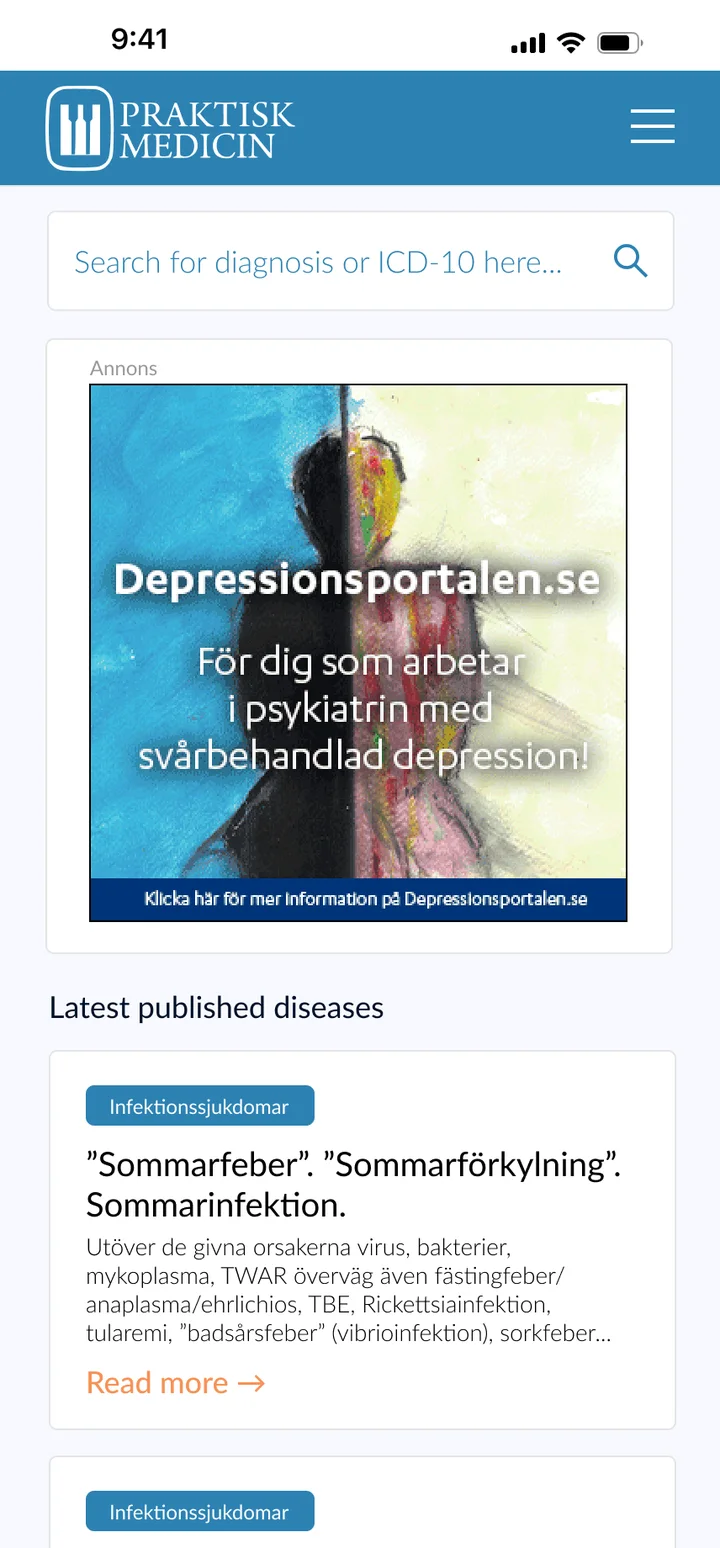
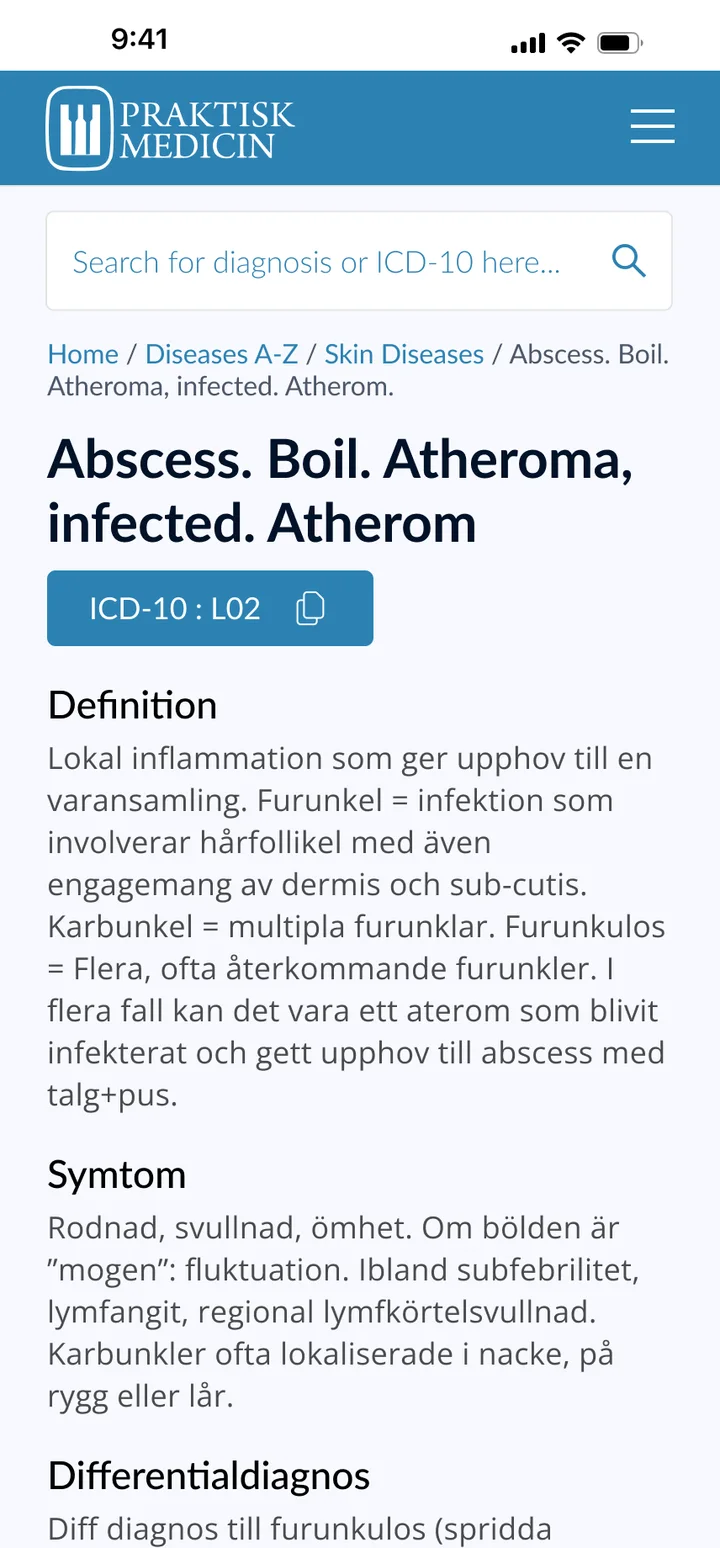

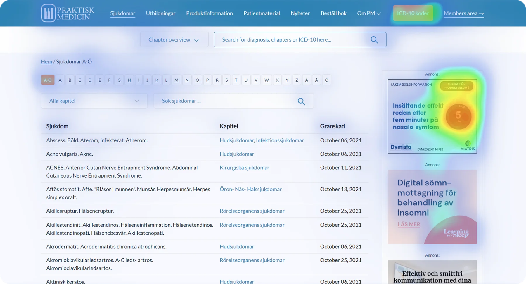
A 50-year-old clinical knowledge platform with valuable content — but clinicians under time pressure couldn't find it fast enough during patient consultations.
Praktisk Medicin is a clinical knowledge platform used daily by healthcare professionals to access evidence-based medical information. The work focused on improving usability, information structure, and content discoverability — supporting faster, more confident decision-making in clinical practice. The brief: redesign and optimize the platform so clinicians can find relevant medical information quickly and reliably during daily work.
Healthcare professionals use Praktisk Medicin in fast-paced environments where time and accuracy are critical. The existing experience contained a large amount of valuable content, but navigating and scanning it quickly was challenging — especially during patient consultations. The main challenge was organizing complex medical content — symptoms, diagnoses, treatments, references — into a clear, predictable structure that supported rapid retrieval without overwhelming the user.
Lead Product Designer — UX strategy, IA, mobile patterns, accessibility from day one, validated with medical stakeholders.
Used daily by 10,000+ healthcare professionals across Sweden. Mobile patterns built for time-pressure use; accessibility decisions that compound across thousands of pages.
How I approached it, step by step.
Focused on what clinicians actually do daily — searching for conditions, navigating between related topics, accessing actionable treatment guidance. Strong visual hierarchy, readable typography, and consistent UI patterns to reduce cognitive load.
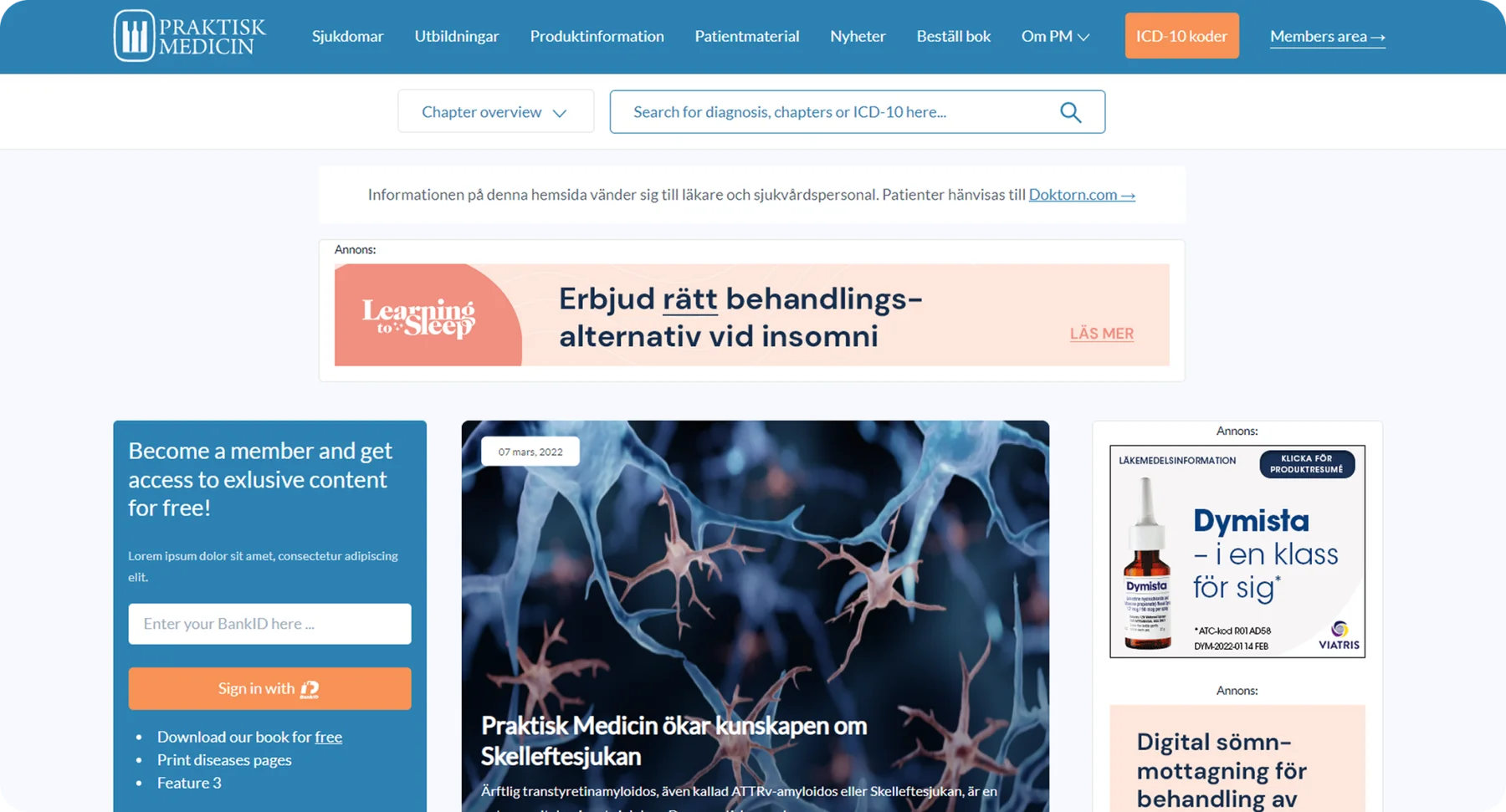
I worked closely with medical stakeholders to ensure the structure reflected real clinical workflows. Iterative design and validation aligned the interface with how healthcare professionals think and work in practice — not just how content is organized editorially.
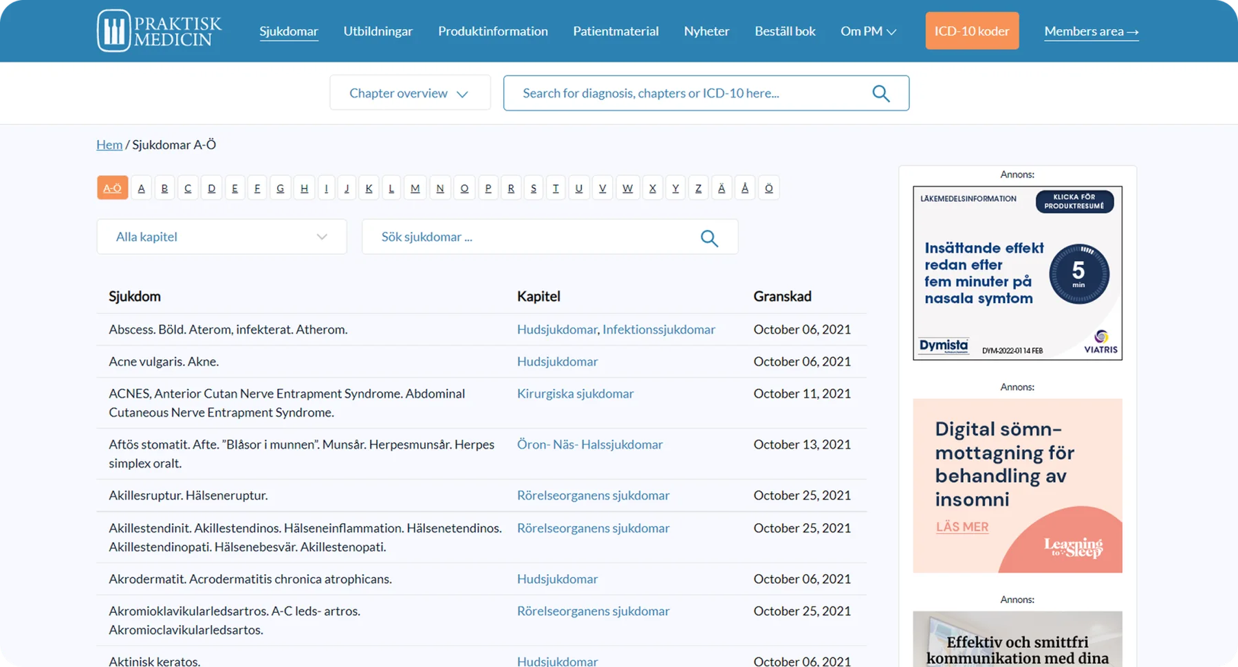
Mobile usage is common in clinical environments — clinicians moving between patients, accessing information quickly. Layouts optimized for vertical scanning, clear content grouping, touch-friendly elements, strong typographic hierarchy.
Accessibility informed type sizes, color, contrast, and component structure from day one — the kind of decisions that compound over thousands of pages of editorial content.
Every design is a set of choices. These were the big ones.
The options I weighed, and why I chose what I did.
The shipped screens, and what changed.
Before: Editorial-led taxonomy — content organized by how it was filed, not how clinicians think during consultations.
After: Workflow-led taxonomy — structure mirrors clinical reasoning, retrieval feels obvious instead of searchable.
Content organization should match the user's mental model, not the editor's filing system.
Before: Desktop-shaped pages on phones — slow to scan during patient handoffs, accessibility patchy.
After: Mobile disease detail — vertical scanning, touch-friendly, critical info first, accessibility built in.
Phone-in-pocket use during patient handoffs is a different context from desk-deep-dive. Optimize each for its real moment.
A closer look at the final design.
Used daily by over 10,000 healthcare professionals across Sweden. The platform consolidates evidence-based medical knowledge into a single, accessible interface, helping clinicians make informed decisions with confidence while working under time pressure.
Information architecture beats decoration in editorial-heavy products — predictability is a feature.
Accessibility decisions made early compound across thousands of pages of content.
Working alongside medical stakeholders made the difference between editorial-shaped content and clinician-shaped content.
Editorial-heavy products live or die on information architecture. A pretty UI on top of a bad IA still fails — and most clinical platforms fail there. I'd start every editorial product the same way: an IA workshop with stakeholders before any pixels. The other take-away: accessibility decisions made on day one compound across thousands of pages of content. Day-one is the cheapest place those decisions ever cost you.
“Working with Martin on healthcare-focused projects for clients such as Botox and Pfizer was an excellent experience. He combined strong UX/UI expertise with a solid understanding of frontend constraints, ensuring that designs were not only user-centered but also feasible to implement.”