Two surfaces — mobile for employees, web for managers
Why: The privacy boundary had to be visible by default. Same app for both audiences makes the line negotiable; two surfaces makes it structural.
An employee wellbeing platform that replaces boring surveys with engaging daily check-ins — a mobile app for employees and a real-time web dashboard for HR.
View Live Project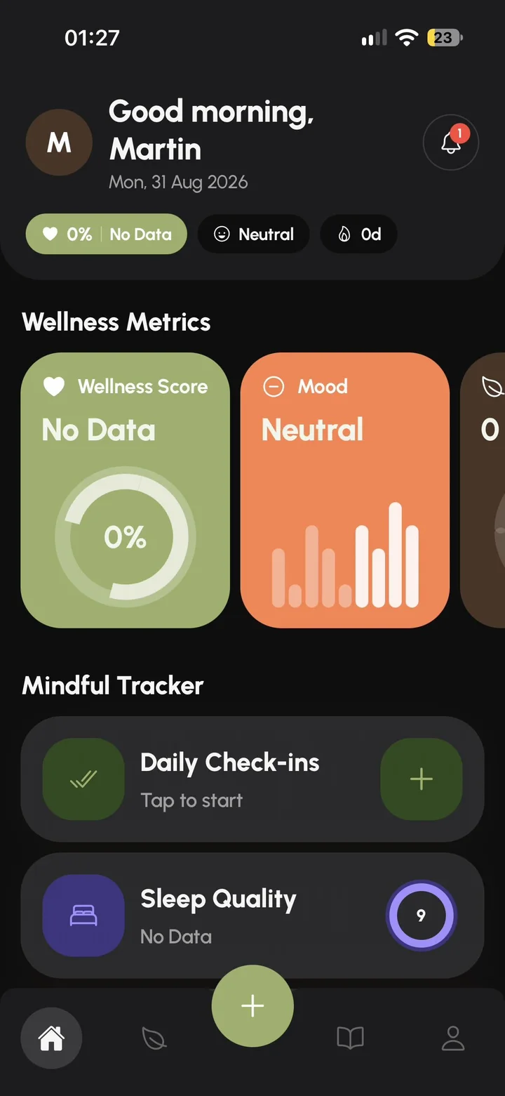
Workplace wellbeing tools fail at the same place — long, boring surveys employees skip and HR can't act on.
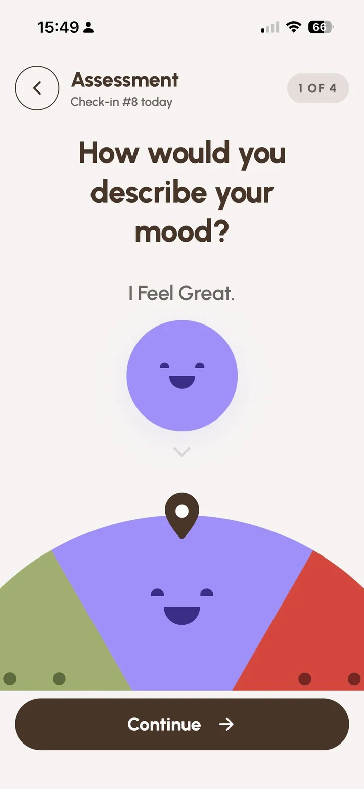
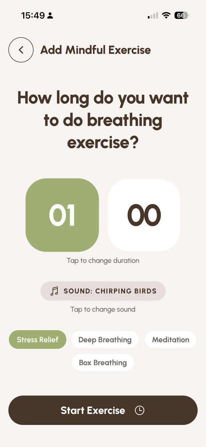
Most workplace wellbeing tools fail at the same place: long, boring surveys that employees skip and HR can't act on. Vibeshift replaces them with a 60-second daily check-in on mood, sleep, stress, and energy — paired with a private journal, guided breathing, and personal streaks. Managers and HR get a real-time dashboard with department trends and actionable recommendations, while individual journals stay private.
Designing a wellbeing tool that employees would actually want to use daily — not because HR forced them — while also giving managers something more useful than yearly engagement surveys. The constraint: build trust on both sides simultaneously. If employees suspect their journals are visible to managers, they stop using the app. If managers can't see anything, the company won't pay for it. The design had to make the privacy line obvious by default.
Founded the studio and led product end-to-end across mobile, web dashboard, brand, and go-to-market.
Shipped to Early Access — a 60-second daily check-in, offline-first, with a privacy model that's structural, not opt-in.
How I approached it, step by step.
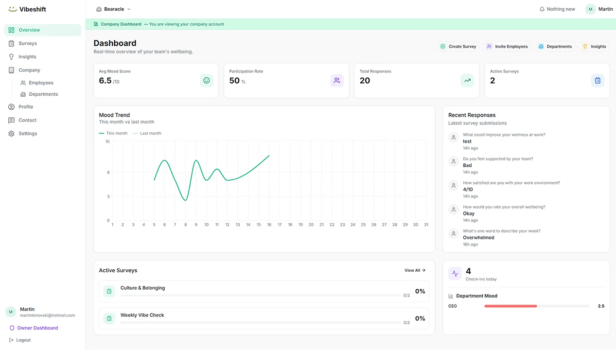
Vibeshift is intentionally split: a mobile app for employees and a web dashboard for managers. Same brand, same data model, completely different surfaces. Employees never see a 'manager view'; managers never see a 'personal view'. The split is the privacy guarantee.
Wellness assessments cover mood, sleep, stress, and energy — fast enough to feel like a habit, not a task. Engagement is the metric, because data quality collapses without it.
Journals and personal data stay on-device-first and never reach the manager surface. Dashboards only ever show aggregated, anonymous team insights. Departments below a threshold size auto-suppress to protect identifiability.
Assessments and journals save locally first and sync when back online. No lost data, ever — important for a daily-habit product where reliability builds trust.
Every design is a set of choices. These were the big ones.
The options I weighed, and why I chose what I did.
The shipped screens, and what changed.
A closer look at the final design.
Vibeshift launched into Early Access in 2026 under Bearacle. The mobile app delivers a daily 60-second check-in plus journal, breathing, and streaks; the web dashboard gives HR live wellness scores, department trends, and recommended next actions. The privacy model — personal vs. aggregated — sits at the center of the product narrative.
Wellbeing apps live or die by trust. Design the privacy line first; everything else follows.
HR buys outcomes, employees buy daily-use ergonomics — both surfaces have to win, separately.
Defaults matter more than settings. Anonymity-by-default beats opt-in-anonymity.
If I were to revisit Vibeshift today, I'd push earlier on a structured way for managers to act on insights — the dashboard surfaces signal beautifully, but the next mile is recommended interventions, not just charts. That's the V2 thesis. The other lesson: privacy isn't a feature, it's the product's spine. Every shortcut around it costs more later.